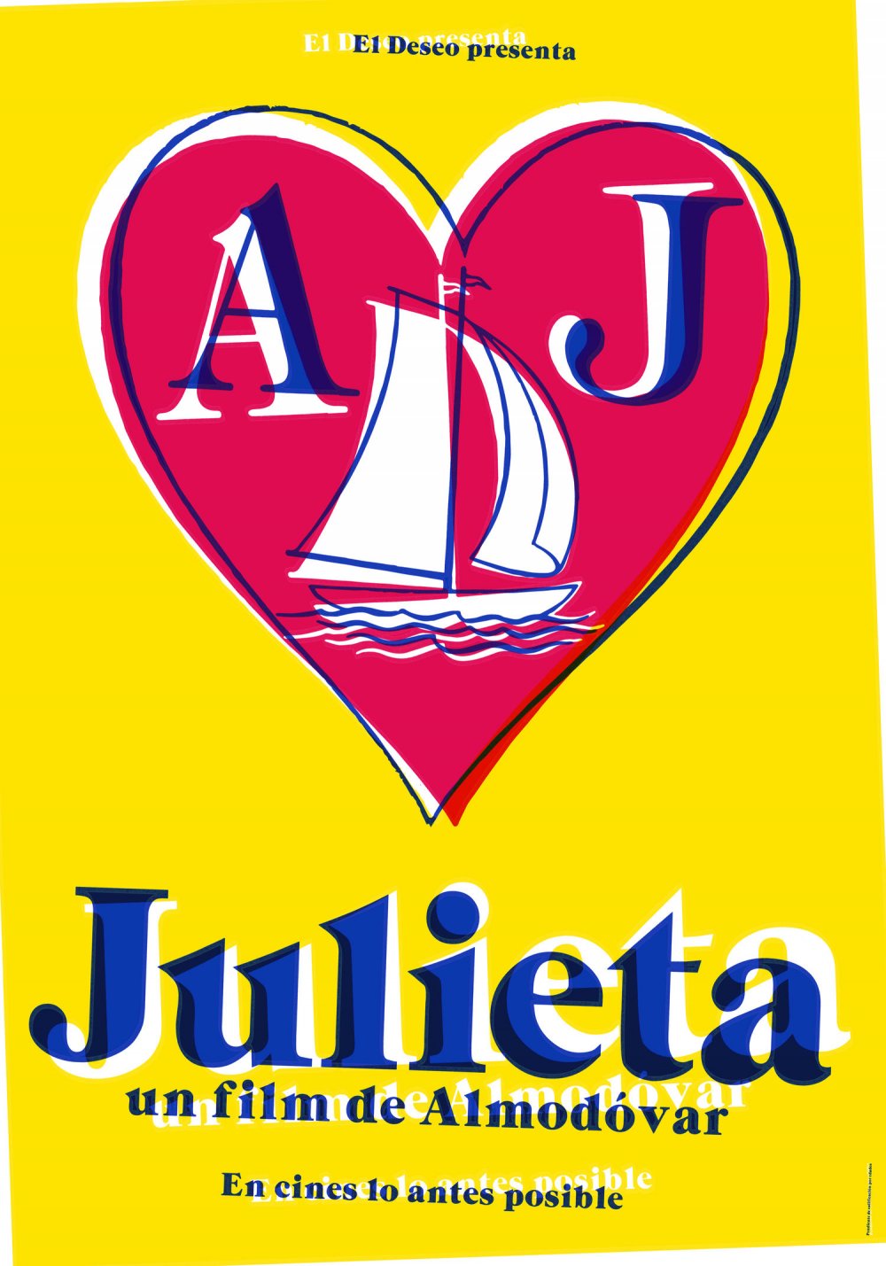
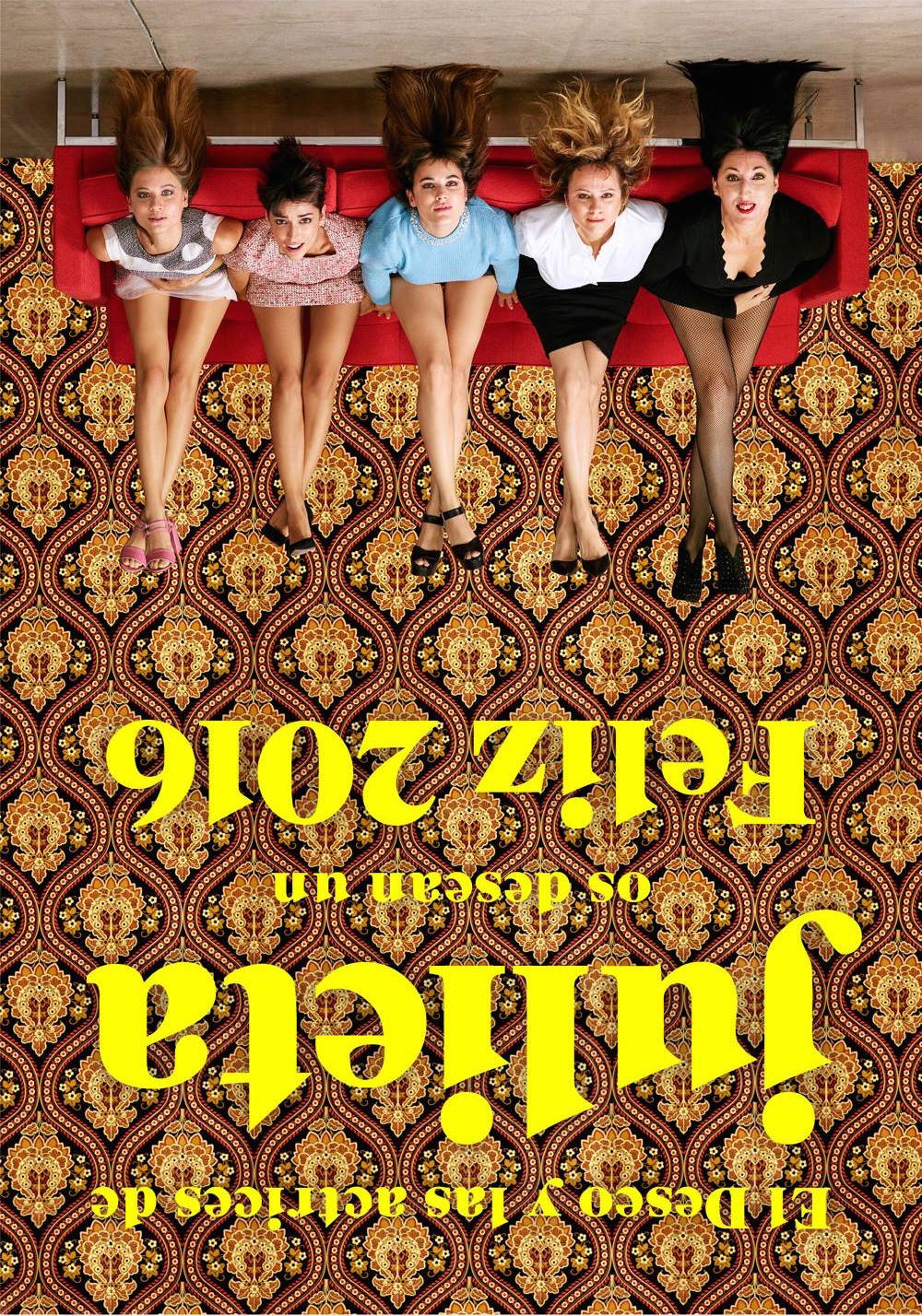
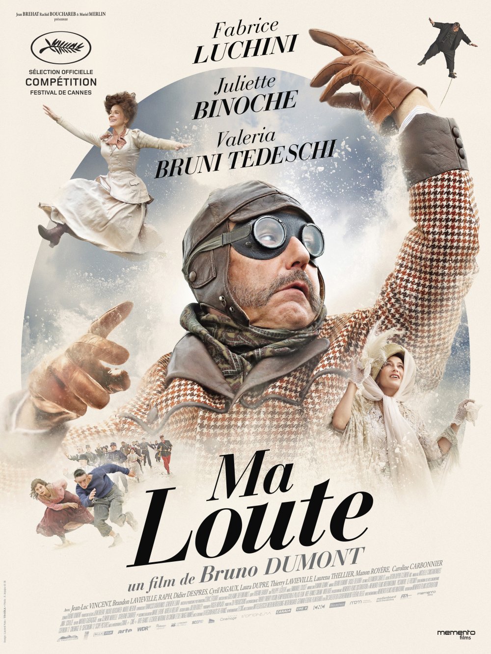
Ever noticed how first-look and festival posters for films are often a lot nicer than the ones you see on the high street? They’re not covered in star ratings and film hacks’ quotes. It’s purely up to the design to excite you about the film.
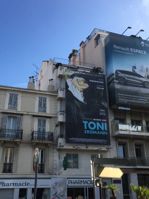
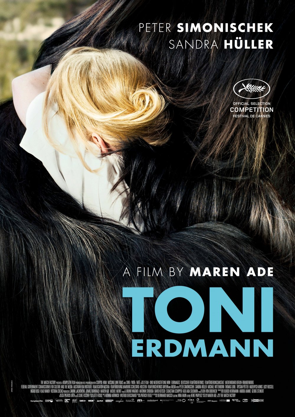
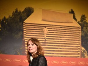
A festival poster for Toni Erdmann on show during Cannes 2016
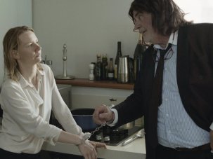
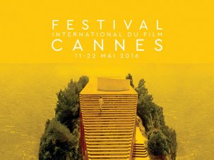
As I wrote last year, it’s a shame these posters aren’t more visible on the bland designer streets of Cannes. The exception is the festival’s own poster, which of course is everywhere. This year it’s is a luminous yellow-gold-tinted still from Jean-Luc Godard’s Contempt (1963): Michel Piccoli climbs the stairs of the Modernist mansion of Casa Malaparte with the Mediterranean sea behind reaching out to the horizon. The red-carpeted stairs of the Grand Palais, sharing the same watery background, are the intended allusion; in fact they rather wither in comparison, but the good news is that here we have a poster featuring a film about filmmaking. It’s fitting, in a year that has delivered many impressive movies, and particularly ones directed by women, like Maren Ade’s Toni Erdmann, that Cannes hasn’t resorted to its normal trick of plastering an actress’s face all over its poster.
The Directors’ Fortnight design deserves a special mention too, for it looks like a torn movie poster. “Two characters who perhaps stepped out of an English or Italian comedy or an Éric Rohmer film?” is their explanation behind the design. Nicely scruffy and abstract, it shows what the upstart sidebar offers: often much edgier fare than the official Competition and Un Certain Regard selections.
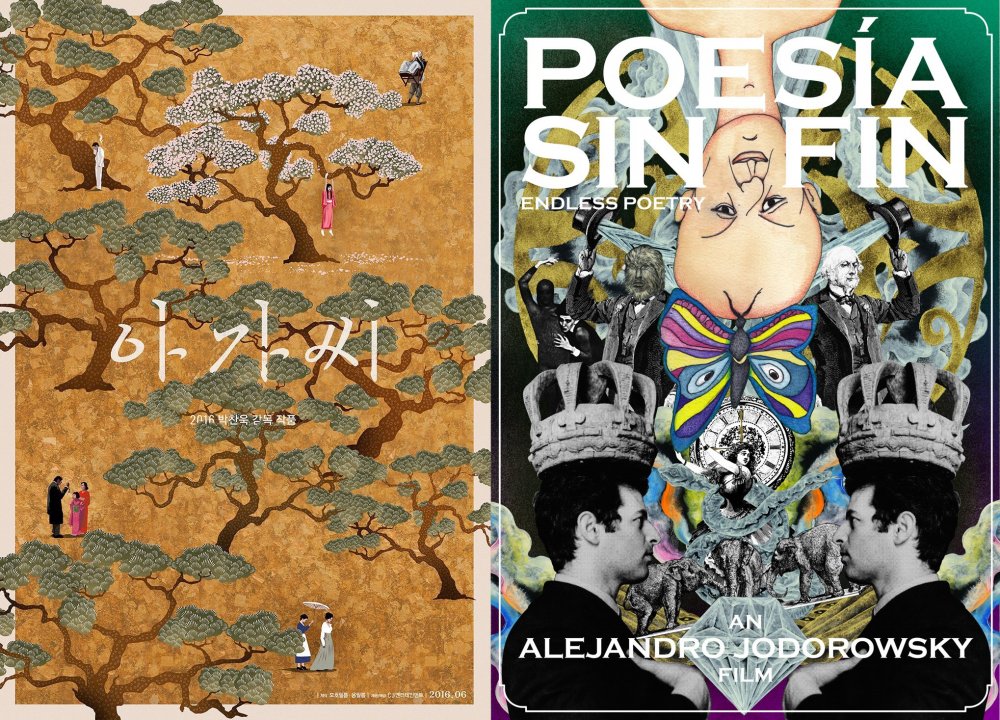
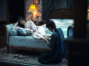
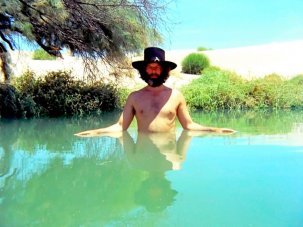
Surveying the posters on show across all the competitions and other slots this year, our entirely fictional Poster d’Or award is shared between two designs: the exquisite, intricate art for Park Chan-wook’s The Handmaiden and the bonkers psychedelic collage for Alejandro Jodorowsky’s Endless Poetry (Poesía sin fin). These are the most outlandish posters on show.
And judging from past designs for their films, both directors appreciate the art of the still trailer – particularly Jodorowsky. Run an image search on his posters and you’ll see what I mean. The design for Park’s movie is an ornate tapestry in a stately gold; but look closely and you can see hints that behind the resplendent spectacle lies an erotic thriller. It’s a poster which, judging by the reviews so far, the film struggles to live up to.
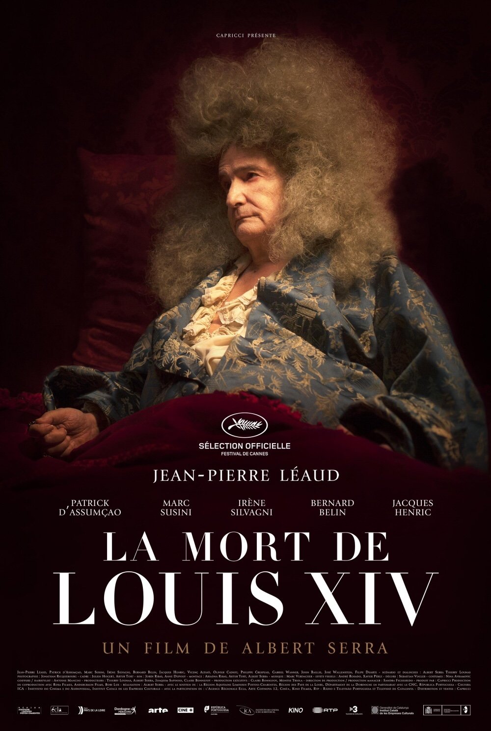
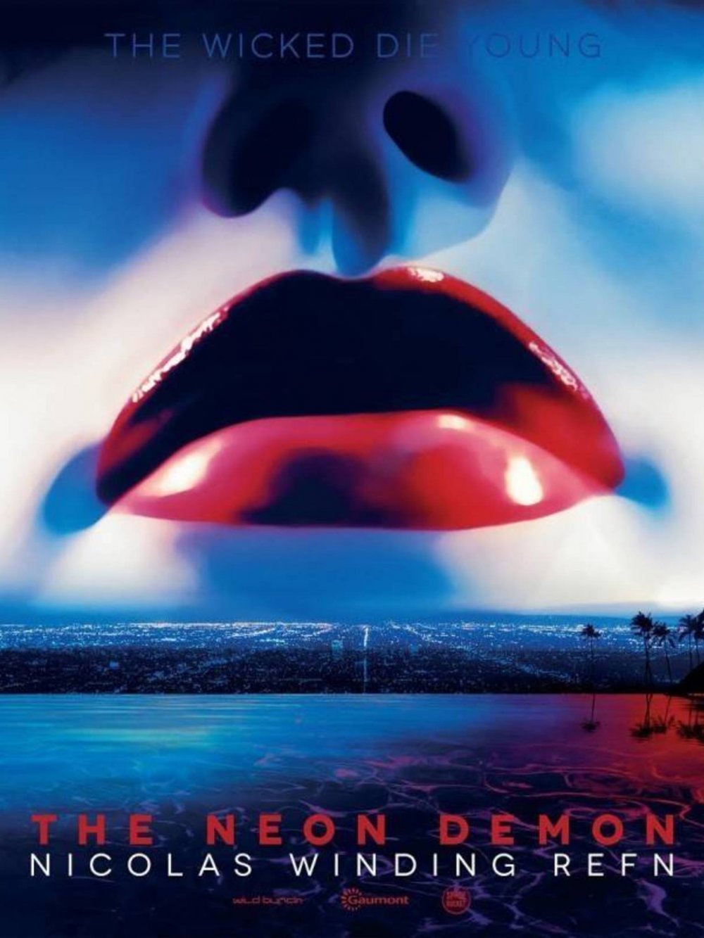
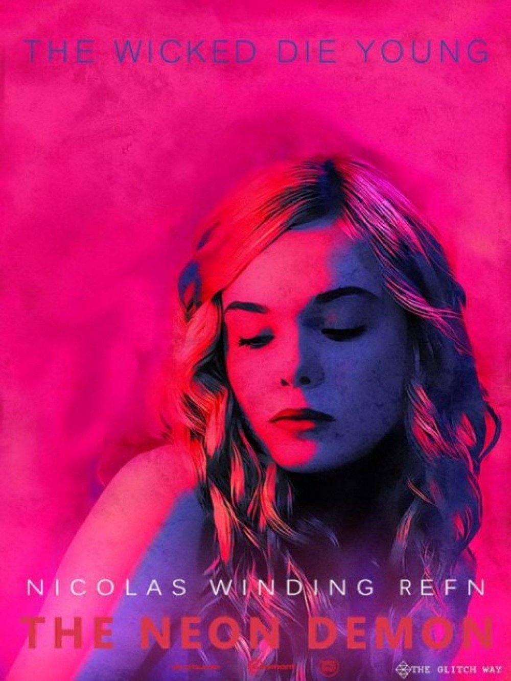
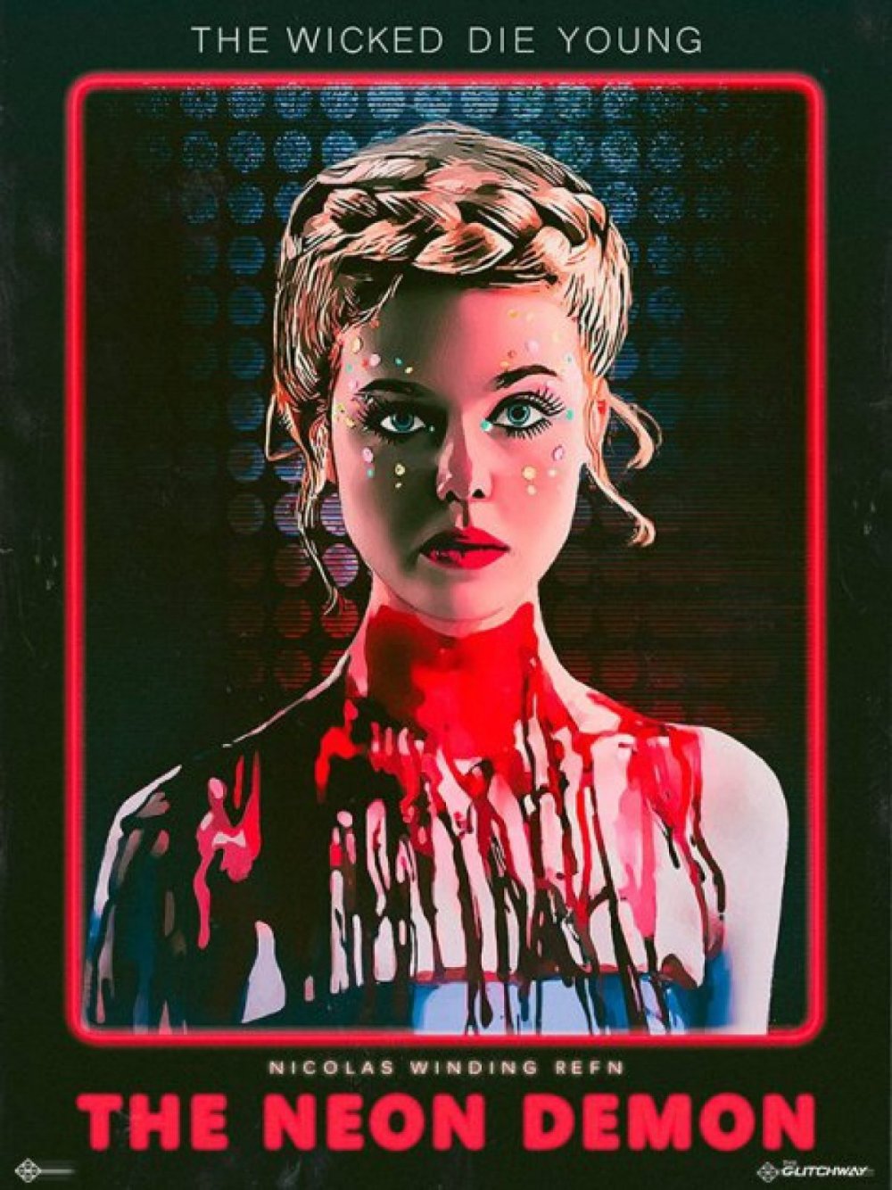
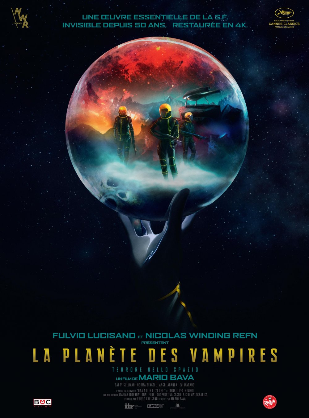
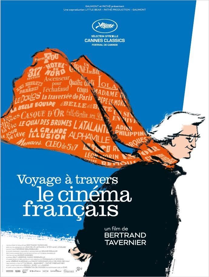
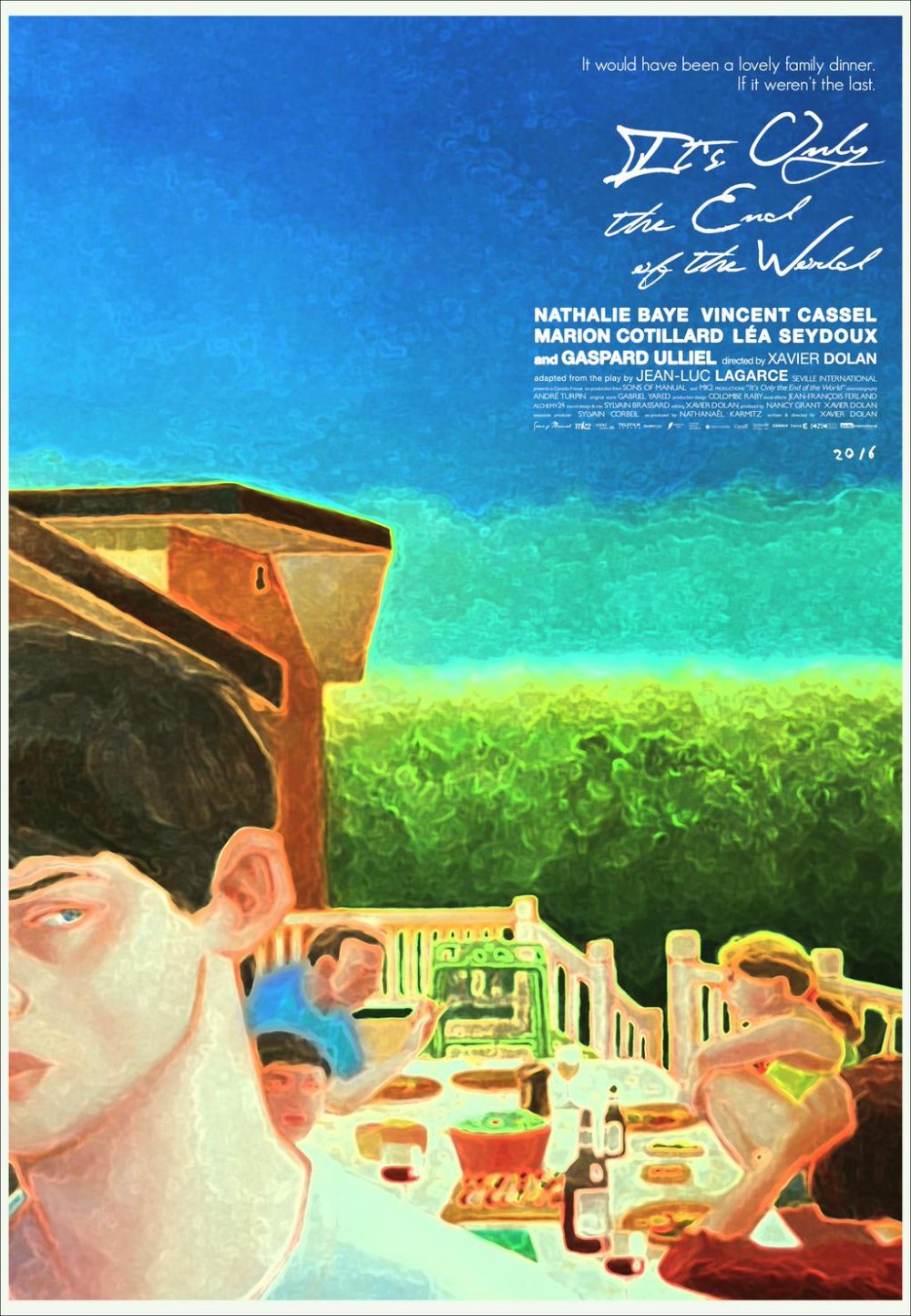
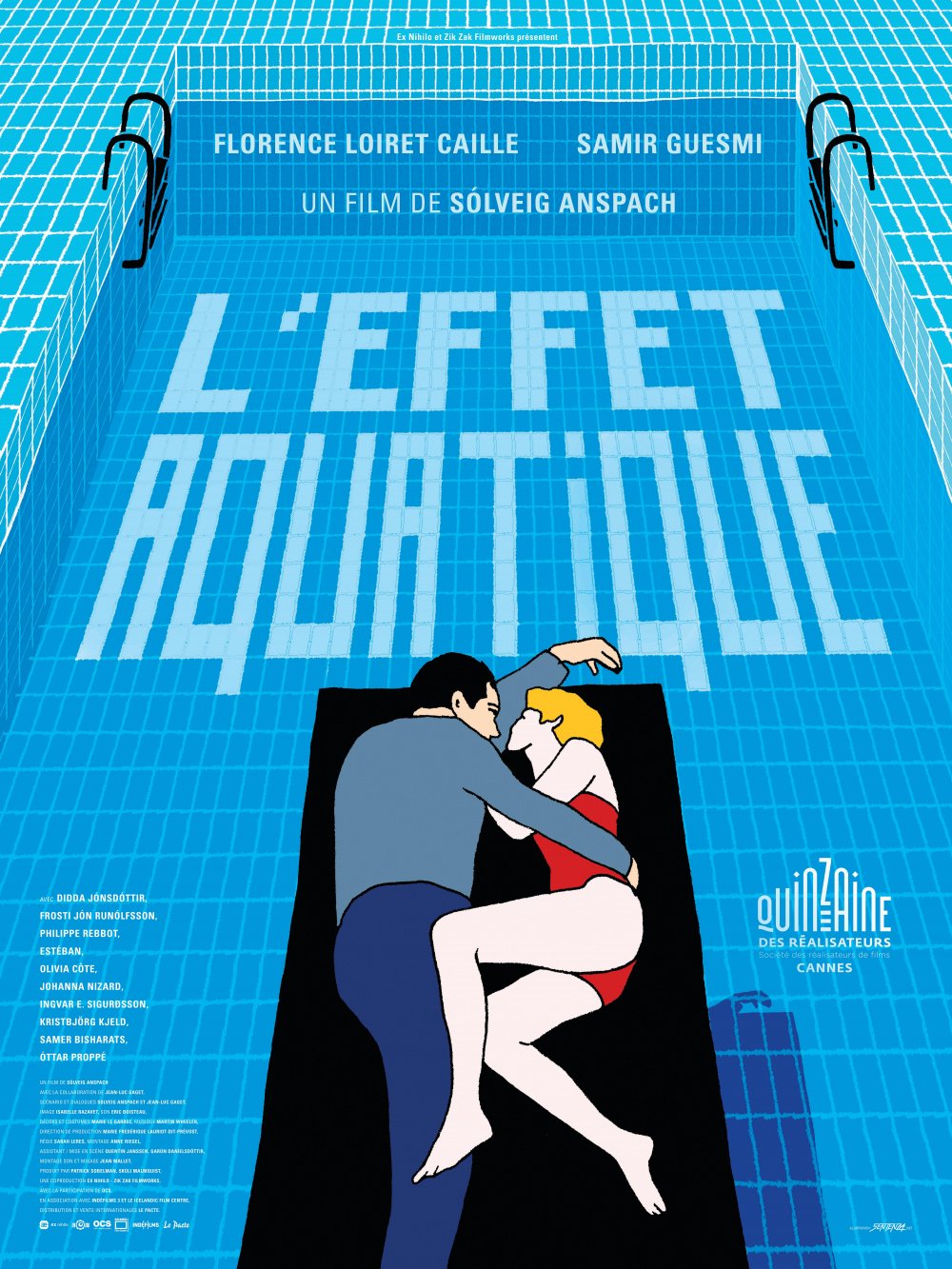
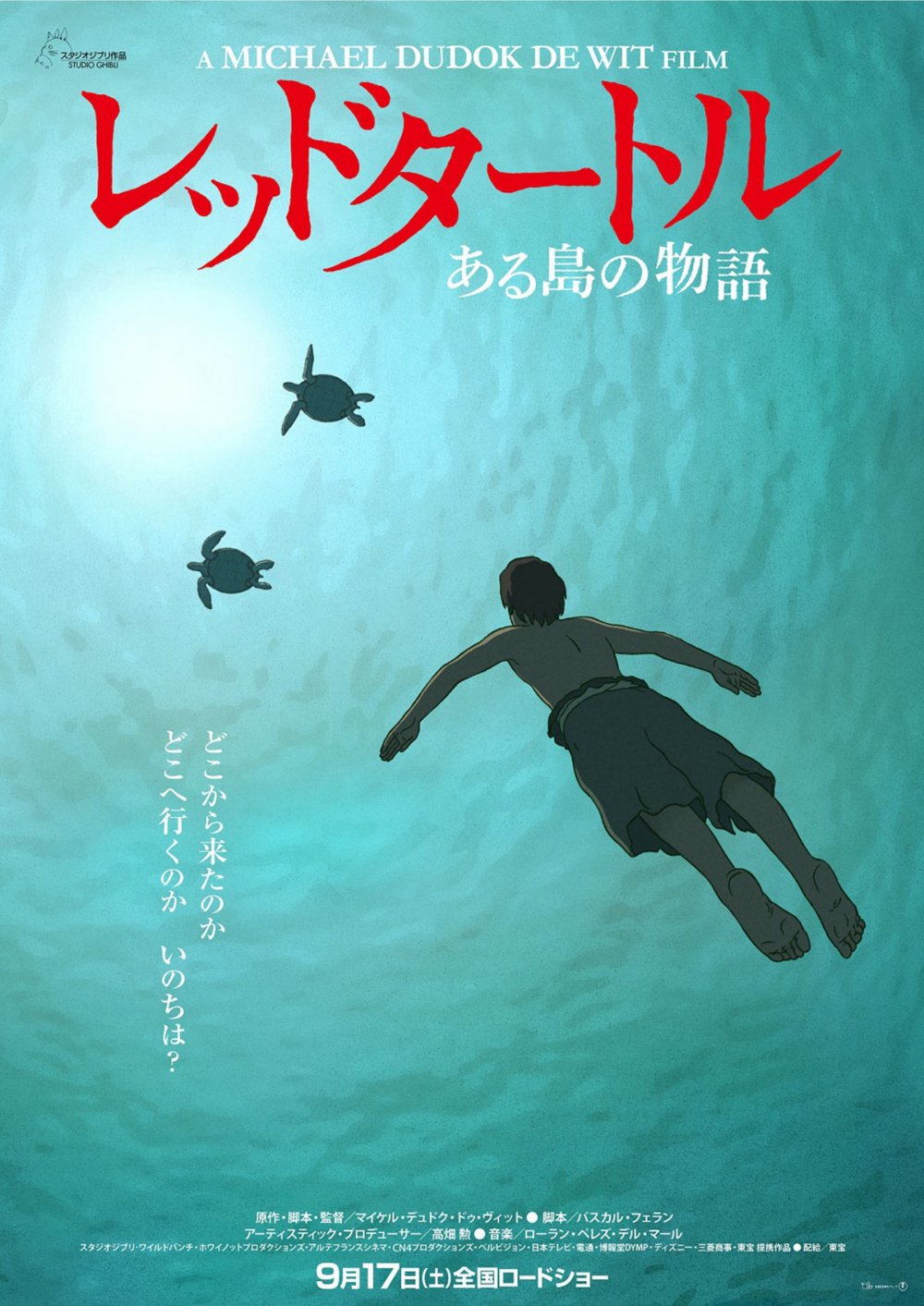
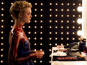
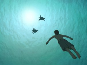
Other highlights include the surreal hairy art for Maren Ade’s Toni Erdmann; the hairy spectacle of Jean-Pierre Léaud’s Sun King for Albert Serra’s The Death of Louis XIV; the multiple pulpy and chromatically-popping designs for Nicolas Winding Refn’s The Neon Demon – plus a similar one for The Planet of the Vampires, the Mario Bava film that Refn chose to screen in the Cannes Classic section; a wispy, whimsical ad for Bertrand Tavernier’s grand documentary tour of French cinema (also in the Classics strand); a painterly poster for Xavier Dolan’s It’s Only the End of the World; an imaginative swimming-pool illustration for Solveig Anspach’s watery rom-com The Aquatic Effect (L’Effet aquatique); and the underwater view of a Japanese design for The Red Turtle.
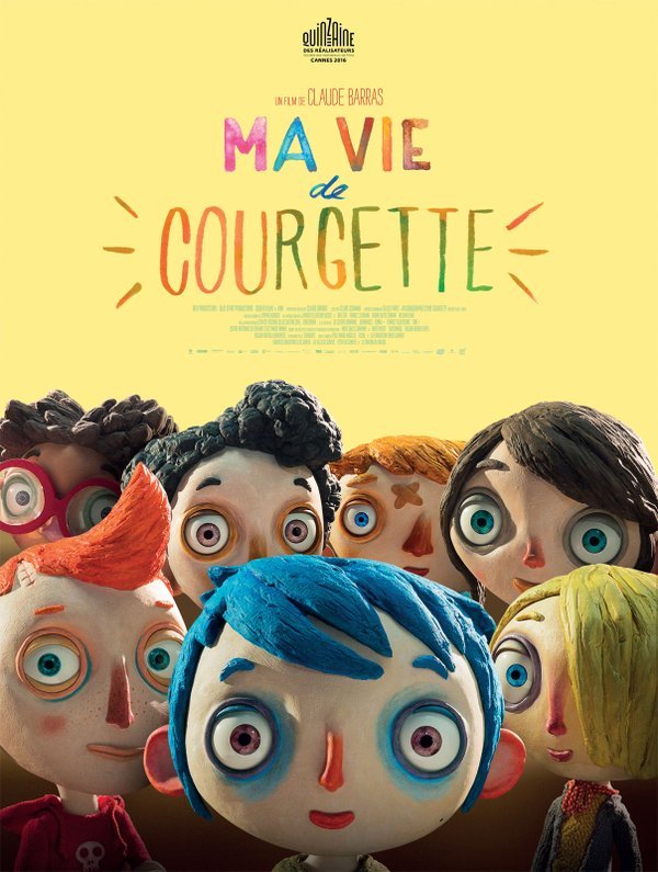
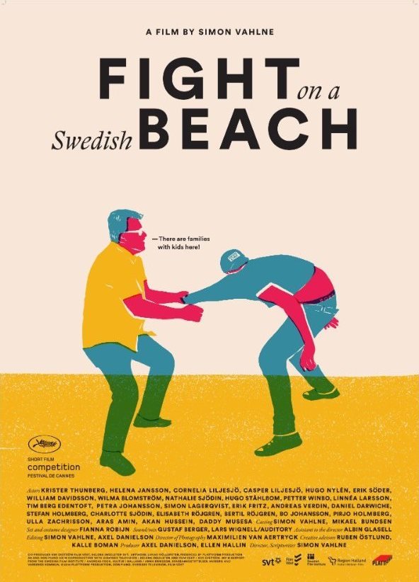
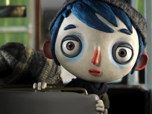
Nor should I forget the crowd of big-headed stop-motion puppet children and the lovingly doodled type for My Life as a Courgette’s poster. And finally, a shout-out to a short film in competition with grand designs: Fight on a Beach, with its vibrant screen-printed art.
-
Cannes Film Festival 2016 – all our coverage
Browse all our coverage of the preeminent showcase of international and auteur cinema.
-
The Digital Edition and Archive quick link
Log in here to your digital edition and archive subscription, take a look at the packages on offer and buy a subscription.

