Web exclusive
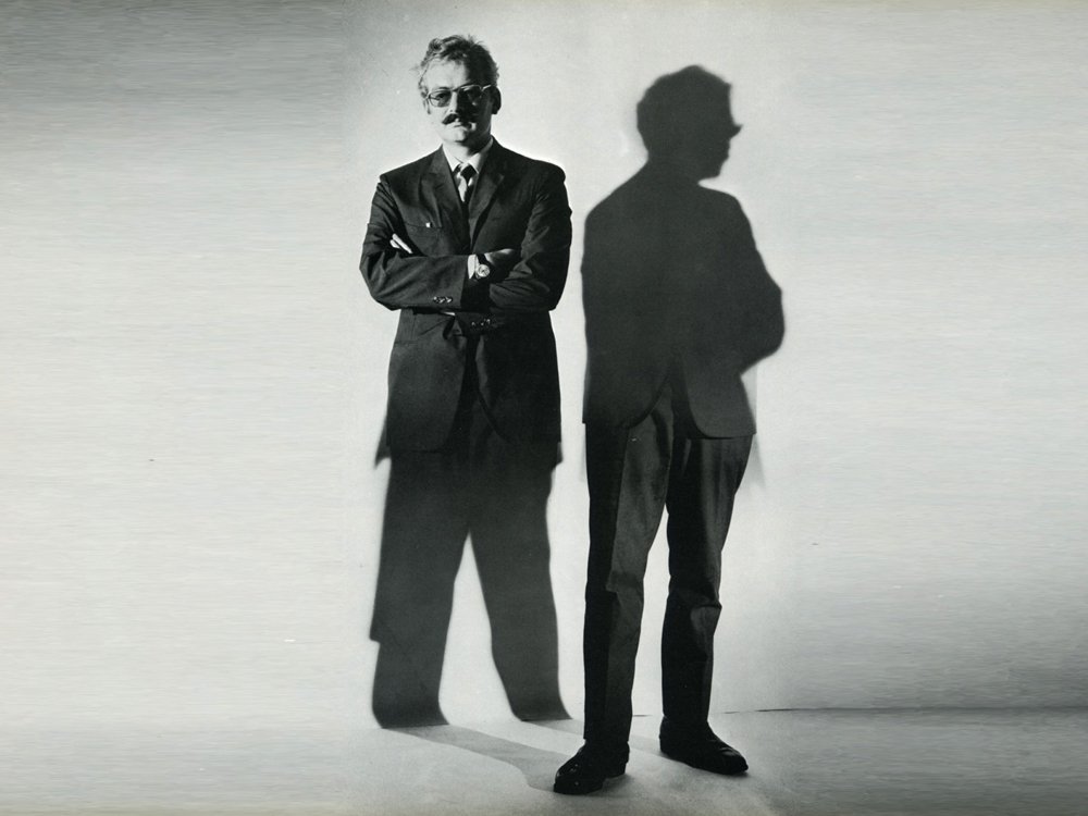
German graphic designer and illustrator Hans Hillmann
In the mid-1950s, West Germans frequenting Frankfurt and Kassel’s cinemas in the afternoon might have stumbled across graphic designer and illustrator Hans Hillmann sitting alone in an empty theatre next to a Rollei on a tripod. Newly graduated in graphic design, Hillmann had started creating posters for the fledgling distributor Neue Filmkunst (New Film Art). This was his research.
The exhibition Hans Hillmann: Film Posters is showing at Kemistry Gallery, London, until 27 September.
An accompanying programme of films that Hillmann designed posters for, including G.W. Pabst’s Westfront, runs at London’s Goethe Institut.
Between 1953 and 1974 Hillmann, who died this May aged 88, designed 130 film posters. Most poster designers work from stills or publicity material; Hillmann meticulously studied the film, creating designs as radical as the cinema his posters advertised: a giant painted battle scene, comprising eight posters, for Kurosawa’s Seven Samurai; a startling close-up of a hand reaching into a pocket for Bresson’s Pickpocket. He enjoyed a long-running collaboration with Jean-Luc Godard, designing eight posters for his films’ German releases. You can even spy Hillmann’s posters in the background of Juliette Janson’s flat in Godard’s 2 or 3 Things I Know About Her – among them a design for Alain Resnais’s Muriel, a poster masquerading as a torn notebook, which Resnais commissioned directly from Hillmann.
Here, German directors Edgar Reitz and Volker Schlöndorff discuss commissioning Hillmann to design posters for their films while Christoph Hochhäusler and British filmmaker Peter Strickland – two contemporary directors who greatly admire Hillmann’s work – reflect on some the most memorable designs he created.
Volker Schlöndorff
Germany, Young Törless, The Tin Drum
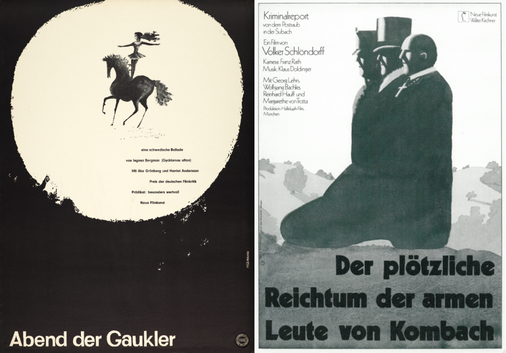
Hillmann’s posters for Ingmar Bergman’s Sawdust and Tinsel (left) and Schlöndorff’s The Sudden Wealth of the Poor People of Kombach (right)
Hans Hillmann’s posters are synonymous, for a whole generation of cinephiles, with Ingmar Bergman’s early films, with Polish cinema, with Milos Forman’s films and of course, with the French New Wave. In stark black and white, with striking wood-carving-like designs, his posters became the trademark and guarantee for a certain kind of arthouse film. They were posters you often remembered as much as the films themselves. To my recollection he was the only graphic artist at the time of the New German Cinema to have a style of his own.
Never catering to the audience like the ‘catchy’ commercial posters did, he always tried to find an image or a composition in which he could condense the entire move, extract its special quality or, for God’s sake, its ‘deeper meaning’. In his poster for my film Der Plötzliche Reichtum der Armen Leute von Kombach (The Sudden Wealth of the Poor People of Kombach) he placed all of my characters in a boot that represented an authoritarian regime. It also looked like an image out of a Grimm brothers tale. Indeed the entire film was there in this picture, but I was worried because I thought its bleakness might scare the audience away. Hillmann’s designs were uncompromising, radical and inspired – as were the movies in those days, alas gone by.
Edgar Reitz
Germany, the Heimat Trilogy, Lust for Love, The Tailor from Ulm
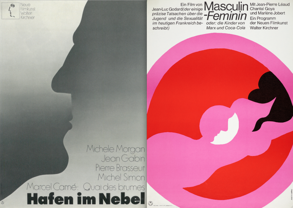
Hillmann’s posters for Marcel Carné’s Le Quai des brumes and Jean-Luc Godard’s Masculin Féminin
I admired Hans Hillmann’s work for many years. Particularly the film posters he made for the very important distributor Atlas Film, as well as those for Walter Kirchner’s distributor Neue Filmkunst. In my opinion, films were almost reborn through his poster art. Films experienced a quasi-second birth through his poster art. Films such as Une femme est une femme or Luis Bunuel’s The Exterminating Angel I remember even today by the visual concepts of Hillmann’s designs. His poster for Marcel Carné’s Quai des brumes, with its the stylised double portrait in two shades of gray, is still lodged in my mind. Another wonderful design is the poster he did for Eric Rohmer’s La Collectionneuse. Hillmann was able to create visual symbols which merged completely with the experience of the movie. In my opinion, films were almost reborn through his poster art.
I didn’t know him personally until the end of 1969 when I was able to show Hans Hillmann my recently finished film Cardillac and asked him to design a poster for it. Cardillac was my second feature film and I tried to continue my path as a filmmaker in the New German Wave in midst of these revolutionary years. I had brought a selection of stills and was amazed that Hans Hillmann showed no interest in the pictures of the actors, but instead talked to me, the writer and director, to fathom the deeper motives of the film and its history. To pick a theme for the poster, Hillmann wanted to understand the focus of my work which he believed to be my obsessions and fears.
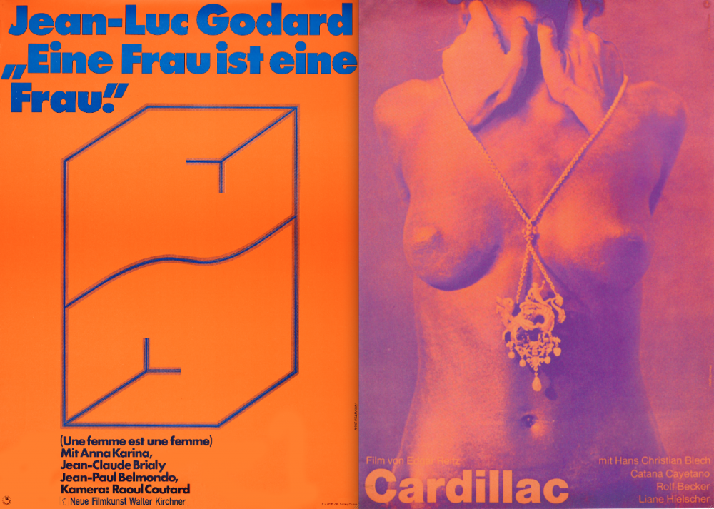
Hillmann’s designs for Godard’s Une femme est une femme (left) and Cardillac (right)
When I told him that in the figure of Cardillac I saw the problem of art and madness, and in Cardillac’s way of working I also saw my father, who was a watchmaker and a goldsmith, Hillmann started to interpret these narratives to produce the poster. My daughter, Susanne, modelled the role of the female protagonist, while the hands of the goldsmith, who adorns his model with historical jewellery, which is also part of the film, and simultaneously threatens her with murder, were my own hands wrapped around her delicate neck, strangling her.
A special element of the design was the choice of colours, selected so that they had an irritating flicker effect. Hillmann loved to use such colour contrasts that upset peoples’ eyes and that produced an unusual effect from a distance – which is so important for a poster. I still love this design for Cardillac very much because it is not only an illustration of the film, but a deep psychological analysis of its autobiographical background.
Peter Strickland
US, Katalin Varga, Berberian Sound Studio, The Duke of Burgundy
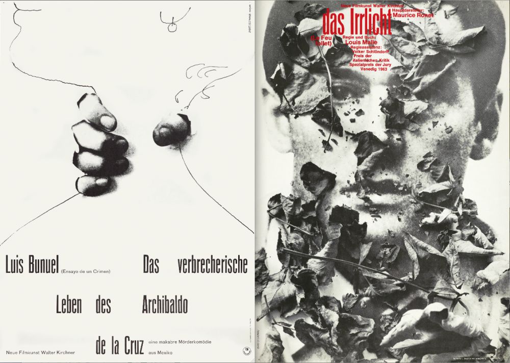
Hillmann’s posters for Luis Buñuel’s The Criminal Life of Archibaldo de la Cruz (left) and Louis Malle’s Le Feu follet (right)
The wonderful films and posters by the Quay Brothers opened a portal for me into a secret world of design from behind the Iron Curtain: Barbara Baranowska, Andrzej Bertrandt, Andrzej Pagowski, Zoltan Kálmánchey and several other designers from Hungary, Poland or the former Czechoslovakia all made incredibly striking work, though I was yet to peer over the border of the latter two countries into Germany and the world of Hans Hillmann – perhaps the most original poster designer of them all.
It was through the musician and filmmaker Douglas Hart that I got to know Hillmann’s film posters. In 2011, he showed me Hillmann’s poster for Luis Bunuel’s The Criminal Life of Archibaldo de la Cruz which, with its cut-out collage of hands ripping through the poster to strangle a line drawing of a neck, opened me up to an aesthetic that was often stubbornly minimal, enigmatic yet very direct in conveying a strong mood.
There are many Hans Hillmann posters that I love, but if I had to pick one, it would probably be the obvious choice – Louis Malle’s Le Feu follet. This encapsulates most of what I love about Hillmann’s work – there is nothing illustrative to give you any entry into a narrative. Hillmann rather conveys mood and mystery through the scattering of dried leaves over a sepia portrait of a man. Hillmann often incorporated found objects into his posters, letting them obscure, shatter or protrude through the surface. Leaves, glass and other detritus all combine to give a three dimensional effect. It’s as if Hillmann was let loose on the film set during the shoot and allowed to collect props or any material that was present.
It’s a very active form of design, which ignites the imagination in anyone who sees the posters. You don’t quite know what will happen in the film being advertised, but a sense of its atmosphere draws you in. The typeface is simple; its positioning within the design contributes to such a direct and striking overall image. Hillmann and many of his contemporaries ignored the Western way of placing layers of horizontal text at the bottom of a poster, as if it were a separate component but clearly incorporated the credits into the composition, either harmoniously or disruptively.

Hillmann’s design for the cover (left) and inside cover (right) of the programme for Luis Buñuel’s The Criminal Life of Archibaldo de la Cruz
The irony of such unique poster art by Hillmann and other artists from the 60s is that diabolically expensive originals of these can be found gracing the walls of film industry offices in London, yet they are regarded as museum pieces. The attitude is that those graphic posters belong to the past and that film posters today require shots of actors in an illustrative context. The typical tug of war that goes on between poster designers and marketing teams is the desire to have a poster with its own aesthetic identity versus the need to sell a film. ‘Too graphic’, hence ‘too niche’ are the pejoratives often heard in these meetings.
Film is constantly evolving as a visual and narrative language, yet the vast majority of poster art has stagnated over the last 30 or 40 years. It’s an embarrassment for film when one considers how the music industry has completely embraced the graphic form. Even record sleeves by giants such as the Rolling Stones and Led Zeppelin are infinitely more aesthetically advanced than many posters for art house films.
Still, there are just about enough film poster designers fighting their corner to renew the form. Hillmann’s spirit lives on in contemporary designers such as Julian House, Brandon Schaefer, Sam Smith and most explicitly in Jay Shaw. Shaw’s posters for Klute and Blow Out channel the spirit of Hillmann’s work into something visceral and dynamic. The point is that this kind of imaginative approach to a poster often indicates a similarly imaginative film within.
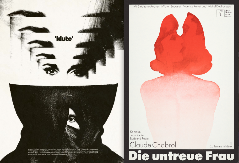
Jay Shaw’s contemporary poster for Alan J. Pakula’s 1971 thriller Klute (left) and Hans Hillmann’s design for Claude Chabrol’s The Unfaithful Wife
There is no shortage of talent when it comes to poster design. The problem is the hindering of that talent by market forces. With the closure of more and more independent outlets, power is falling into the hands of retail giants whose buyers can dictate to distributors what kind of DVD sleeve is supplied before anything is put in stock.
Hillmann’s work may belong to a bygone era, but the ideas he propagated are incredibly modern. There is nothing nostalgic or retro about the majority of his work. He makes me think about films I already know differently, and looking at his designs, I have the urge to go back to a film with the intention of seeing it again anew.
Christoph Hochhäusler
Germany, The City Below, I Am Guilty
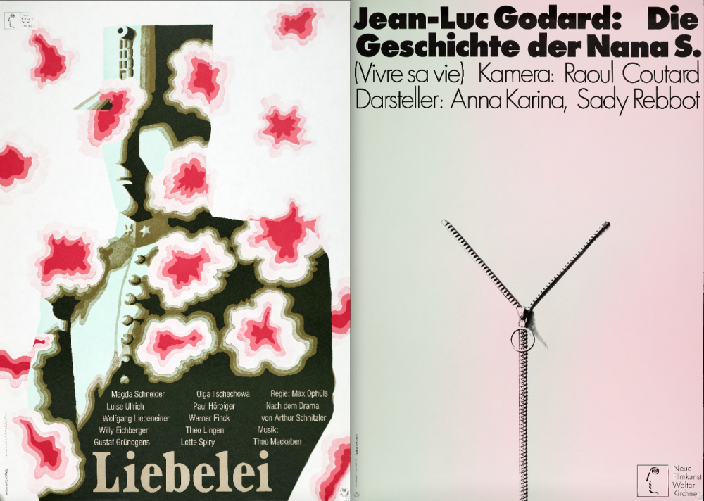
Posters for Max Ophül’s Leibelei (left) and Godard’s Vivre sa vie (right)
My favorite Hillmann poster? There are so many. First, his brilliant 1961 design for Luis Buñuel’s The Criminal Life of Archibaldo de la Cruz. Simple, witty, beautiful, it’s quintessential Hillmann – engaging with the film itself instead of advertising ‘production values’. Buñuel’s film deals with one man’s fantasy of his criminal self – de la Cruz is a killer in imagination only. Hillmann translates this idea using a metaphor that truly belongs to paper: he shows ‘real’ (photographed) hands penetrating the paper and ‘strangling’ the drawing of a woman.
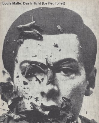
The cover of Hillmann’s programme for Louis Malle’s Le Feu follet
Second, his elegant 1966 design for Louis Malle’s Le Feu follet. Again, there are two levels of reality. ‘Real’ (photographed) dead leaves under which the photo portrait of the film’s hero, played by Maurice Ronet, is ‘buried’. The dark beauty of the poster suggests the melancholy of the film and the main character’s state of mind. But it can also be read as a reference to Joseph Kosma’s immortal chanson Les Feuilles Mortes, a hymn of loss and regret that seems to share the same DNA as the film. In both examples, and countless others, Hillmann playfully varies the film’s themes, involving the spectator in an original visual game that tickles one’s curiosity for the film without ever giving away too much.
Third: Hillmann’s 1967 pop-colored design for Max Ophül’s beautiful 1932 German film Liebelei. The shadowy figure of an k.u.k. (imperial Austrian) officer is transformed by a salvo of what could be flowers or a battery fire of love that is eating up the officer’s contours. A fitting metaphor for the film.
And finally, a different explosion of beauty: Godard’s Vivre sa vie. In what might be one of Hillmann’s most reduced – and most seductive – designs (dating from 1970), the zipper becomes the marker not only for the woman but also for man’s desire to understand and unzip her. It’s so simple but so powerful.
For me, Hillmann was not only one of the defining masters of modernist graphic design, he was also a wonderful human being, modest and generous. A terrible loss.
-
The Digital Edition and Archive quick link
Log in here to your digital edition and archive subscription, take a look at the packages on offer and buy a subscription.


