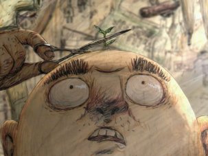
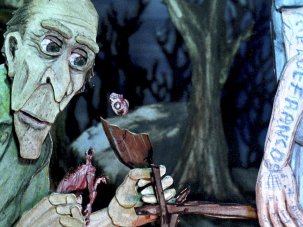
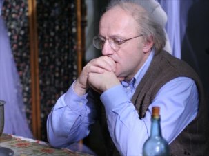
Japanese independent animation has been enjoying a surge in interest in recent years, with Yamamura Kôji’s 2003 Oscar nomination for his short Mt. Head (Atama-yama, 2002) shining the spotlight beyond the more familiar face of the country’s commercial anime industry to reveal a seemingly inexorable wellspring of talent and imagination that has found itself the focus of numerous animation festivals and specialist events across the world.
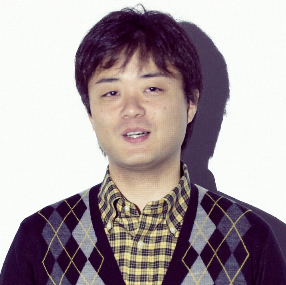
Mizue Mirai
~
Mirai Mizue Works 2003-2010 is available on DVD from CALF in Japan. Wonder is now touring film festivals.
This international visibility has been facilitated in no small way by the efforts of Doi Nobuaki, who in 2010 founded the CALF collective in order to assemble the independent animators Mirai Mizue [homepage], Wada Atsushi, Oyama Kei and TOCHKA under one flag and bring their work to the world, both at festivals and with a series of DVD releases.
It is the eye-catching works of Mizue that are most emblematic of the singularity of vision of this new breed. Born in 1981, he began his playful excursions into the realms of the abstract while a student at Tama Arts University, which he entered in 2002; they have gone on to win awards at the world’s top animation festivals, including Annecy, Zagreb and Ottawa.
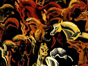
Like the works of Norman McLaren and Oskar Fischinger, his hypnogogic free associations reject narrative almost completely in their contemplation of colour and movement for their own sakes, the mesmerising imagery unfurling as pulsing organic forms, biomorphic blobs, segmented centipedal formations and whirling Mandelbrots and mandalas. Evoking artists like Juan Miró and Yves Tanguy, titles like Lost Utopia and Devour Dinner, in which various critters munch upon one another in a deliciously witty Darwinian microcosm, often feel like windows opened on an alien world.
Alongside this unique strain of what Mizue himself terms ‘cell animation’, the artist has also explored more pure geometric forms. The minimalistic lines and blocks of Metropolis (2009) and Modern (2010), while equally non-representational, suggest of a realm of completely human fabrication.
Lost Utopia – 60-Second Version (2007)
There is nevertheless a similar modus operandi at work, not only in that all of these films are painstakingly realised completely by hand, but also in how their shifting forms demonstrate an innate understanding of how image and sound can complement each other perfectly. Such synaesthetic qualities are much in evidence in titles like Trip!-Trap!, with its jazzy score by Alice Nakamura, Tatamp, realised in collaboration with the sound designer Suda Shinichi (aka ‘twoth’ [homepage]), and the visual mood music of Wonder.
This most recent title was conceived as the ultimate endurance test for the solitary animator: in 2012 Mizue set himself the task of creating and uploading to the internet one second of animation (consisting of 24 hand-drawn frames) each and every day over the course of 365 consecutive days, with the last image of each day becoming the starting point for the next.
The results clearly paid off, as Wonder [homepage] was selected to compete in the Berlinale Shorts section of the 64th Berlin International Film Festival in February. Since then this eight-minute short has screened widely across Europe, premiering in the UK at Birmingham’s Flatpack Film Festival, where Mizue was in attendance for a retrospective of his and the other CALF animators’ works. I had a chance to catch up with him and talk about his career during his return through London, with CALF founder Doi Nobuaki interpreting.
Playground – 60 Second Version (2010)
What is your background as an animator?
I had some interest in stop-motion animation when I was younger, because I was really inspired by the work of Jan Švankmajer, but also Japanese tokusatsu special-effects titles like Ultraman or Godzilla.
When I began my own animations, I was studying in the Graphic Design department of Tama Arts University, but they didn’t have any official animation training there. However, a key influence on me during this time was Professor Masahiro Katayama, who passed away in 2011. He wasn’t really known as an animator so much as an illustrator and a very important teacher. I was introduced to a lot of different kinds of films in his classes, by important figures such as Yuri Norstein, Priit Pärn and others. Before this time, I had thought of Švankmajer as something like tokusatsu, but then I came to realise he belonged to a very rich tradition of artistic animation, and it was like discovering a whole new world.
During my first year at university, I kept trying to make a stop-motion animation film, but I found it very hard, because you really need to think about such aspects as creating the sets for your story and then about lighting them, these kind of considerations. In my second year, I remember taking a course in drawn animation, which really changed my approach. At the same time I was doing a lot of illustration work, using the multiple cell patterns that I’m known for.
Nowadays, I basically make half of my living through animation commissions, and the other half teaching animation and a little bit of illustration.
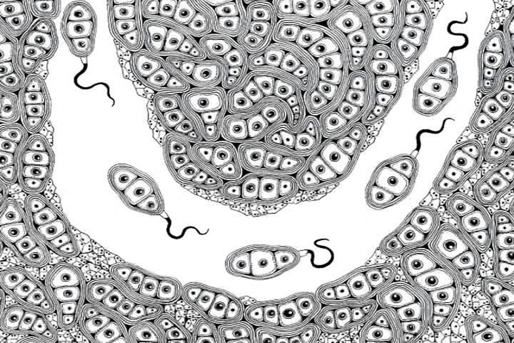
Fantastic Cell (2003)
Fantastic Cell (2003) was your first film, made while you were still at university. Your distinctive style seems already pretty much fully formed at this point, and not developed over time as one might expect. I’m impressed how accomplished it already was in terms of the fluidity of its motion.
I’d never studied animation properly when I came to make this film. My motivation was that I wanted to make my drawings move in a particular way. Maybe why this is why this had such a distinctive style, as I never set out to achieve any particular goal when I started it.
I’d never considered movement before when I was just drawing, so when I came to make my first and second films, it was this aspect which struck me the most. I think that’s why I’ve come to place this emphasis on fluid movement. When I look back on it now, though, I don’t think of these earlier films as being particularly fluid, because my main emphasis was in how detailed I could make the images.
I changed my mind when I went to Annecy Animation Festival in 2010 and saw the film Love & Theft [Vimeo link] by the German animator Andreas Hykade. It was quite shocking for me, because this film consists of really fluid movement, and I was ashamed I’d been shooting each image on two or three frames. I think abstract or non-narrative animators shouldn’t work like this; each frame should be a new and different part of the movement. After that I started to put a lot more emphasis on the movement.
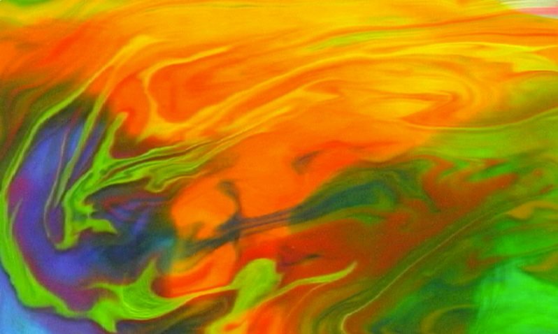
Minamo (2003)
Minamo (2003) is another really early work, but very different from your other films in that it isn’t hand-drawn at all. How was this realised?
I had a white tray full of water, put drops of different ink colours into the water and blew them around the tray with a straw while taking still pictures from above every so often. I don’t know if you could call this animation, because I wasn’t recording the movement itself, but [rather] creating it from a succession of still images. I think you could call it that – it’s certainly what I was trying to achieve, but after I made it I thought, “Hmmm, maybe that’s not animation.”
On a technical level, it seems quite closely linked to your later work Adamski (2008). Can you tell me a bit about this one?
George Adamski was a ufologist, known for his photos of UFOs – his name is pretty well-known in Japan. The film was made while I was editing Devour Dinner, because I wanted to have some sort of diversion. Because Devour Dinner took such a long time to make, I just wanted to make a film very quickly, in one or two days.
Adamski – 60 Second Version (2008)
This was also a test for a film I was also thinking of making at this time, which was influenced by Osamu Tezuka’s Jumping (1984). [Jumping is something of a classic of independent Japanese animation, unfolding as an unbroken six-minute sequence from the point of view of something bouncing increasingly high down a suburban street, each increasingly big jump transporting the viewer further away through a variety of locations: forests, skies, a city, tropical islands, volcanoes and into the depths of hell itself —JS.]
I was thinking of making something like a live-action version of Jumping, so Adamski was essentially a test run, comprised of lots of still photos shot with a digital camera.
Each of your works has a very pure aesthetic of its own, but Trip!-Trap! (2005) seems something of a transitional work in that you mix a lot of the stylistic elements that you would later refine, and it hasn’t quite moved into the realms of pure abstraction yet. Some of it is quite representational, with images of human figures and heads, even though in narrative terms we would certainly call it abstract.
Yes, you’re right. I was exploring various possibilities with this film. I made it after Fantastic Cell, and it was my graduation film from university. I thought at the time it might be the last opportunity I’d have the luxury of having so much time to spend on one project, so I wanted to try lots of different things with it.
At the same time, my friends and teachers were also urging me to try new things, and I was quite young so I didn’t have so much confidence. I remember finding it quite a struggle to make.
Trip!-Trap! – 60-Second Version (2005)
I find it amazing that with such incredibly detailed cellular works, everything is hand-drawn.
Yes, generally speaking everything is hand-drawn, although I do use cut-and-paste techniques on my computer for the layering and compositing.
This style must be incredibly time-consuming. When you made Wonder (2014) you were producing about a second a day, but in general, how long do these films take?
Actually, before I started Wonder I had about two months’ worth of material already stockpiled. I knew it wouldn’t last too long, so literally in every moment of my spare time during its production, like when I was sitting in a café or on the train, or in the evenings after I’d finished my teaching work right up until I went to bed, I’d get my sketchpad out and start drawing…
I think Devour Dinner (2008), at ten minutes in length, is your longest work. How long did it take to make?
About a year, but this was a commissioned work. I made it in 2007, at a time before YouTube dominated video streaming, so it was actually made for a rival Japanese platform, Nifty, who were looking for original content to promote it when it started. They paid me to upload a minute of original animation every month, so the complete work on the DVD is compiled from these. It actually took ten months, because that was the amount of content I was paid for.
Devour Dinner – 60-Second Version (2008)
When I think of your films the first word that comes to mind is ‘synaesthesia’. Do you commission the soundtracks directly, and consciously synchronise the image with the sound?
Yes, I do initially approach the composer and give them an image to give them an idea of what the music should be like, but I don’t give them any real direction after that. I then follow the music after they’ve finished. The film is inspired by the music.
I think there’s really three different styles of music that characterise your films. There’s the watery sound effects of Minamo; Devour Dinner has a lots of different non-musical sounds; then there’s the free-form jazz scores by Alice Nakamura and the more techno-style electronica scores of later work such as Jam (2009).
I like to collaborate with different people who I know, so I’ve no real strong idea of what kind of music I want to use. The results are different because each composer works in his or her own different style, so I follow that.
Tatamp (2011) is the most obviously synaesthetic of your works, I think. I reminded me a bit of something like Disney’s Fantasia, or the artist Kandinsky’s idea that he wanted to create the visual equivalent of music.
I think I am inspired more by Juan Miró’s paintings, which give us this feeling of sound through images. My main idea with Tatamp was to make a visual composition that starts from a single sound, which evolves into a more complicated form, like visual music.
Modern (2010)
It seems that your work has diverged down two very distinct paths – the organic cellular patterns of films like Lost Utopia (2007), Jam and Playground (2010), and the very harsh geometric lines of Metropolis (2009), Modern (2010) and Modern No. 2 (2011). This latter series in particular is interesting, because the films look more naturally suited to computer animation. What was the reasoning behind realising them as hand-drawn animation?
Even before I made Fantastic Cell, I had this idea of making animation from very geometric shapes. I used to like drawing a lot on graph paper, and was interested by the rules this imposed on me as an artist – of not going outside of the squares, for example. I thought it would be interesting to make these kind of geometric shapes move and metamorphose, so that’s why I made Modern.
Each frame was drawn by hand but scanned onto a computer to create the finished animation. Yes, it looks like CG in a way, but I think even though it appears to move in a similar way, the audience gets a different kind of feeling from it. Maybe there’s something intrinsically different about trying to emulate the kind of thing you can do with computers by human hand, so it is this discrepancy I am interested in exploring.
Metropolis is a bit like a two-dimensional variant of Modern, with the same idea of hand-drawn geometry in motion, and again totally non-representational – but I did note that some of the patterns made by the lines resembled the Korean hangul script, and there are some Korean names in the credits.
The film was commissioned for the 13th Seoul International Cartoon and Animation Festival (SICAF). The asked me to make a film that would be shown at the opening ceremony, along with a Korean animator, with the theme of the city of Seoul, so this is why some of the images are very reminiscent of Korean cities. The complex grid-like patterns of the hangul script is ideally suited to that kind of graph paper the film was created on.
Metropolis – 60-Second Version (2009)
With Modern, you seem to be making a point of emphasising the film’s analogue nature through the blurred edges and rounded corners of its framing on the DVD, as though it’s being projected from film onto a movie screen rather than presented full-frame.
In any film, but especially in animation, the contents take place within a rigid rectangular frame whose edges are totally straight. These straight edges of the frame are not created by the animator, but imposed upon them. As the contents I created within the frame for Modern were all comprised of straight geometric lines and volumes, by including it within a softer frame, I wanted to emphasise this aspect more than the film’s hand-drawn nature.
Last year you ran a Kickstarter campaign to create a 35mm print of Wonder. Why?
Because of the very abrupt transition to digital projection over the past year or so, it has been getting very difficult to make 35mm prints. Wonder was totally hand-drawn and I didn’t use any computers for compositing or other visual effects, like the cut-and-paste techniques of some of my previous films. It consists of just plain and simple drawings on paper, so I thought this kind of film was really suited to the simplicity of transferring it straight to 35mm.
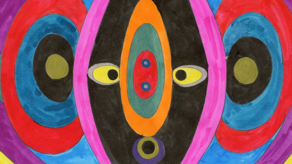
Wonder (2014)
It could well be the very last animation that completely avoids any digital process, from its production right up to its projection…
Probably. Already most film festivals wouldn’t even accept it on 35mm, only as a DCP. When it was selected for Berlin, they initially didn’t want to show it from a film print with an optical soundtrack. We really insisted they show it from film, and they eventually relented and were able to show it from 35mm this one time. There were actually three prints made of the film: one in Japan, one in Europe and I have the other with me now.
What’s next for you?
I currently have three projects I’m thinking about. The first is a collaboration with Junpei Fujita [another independent animator, not to be confused with the musician of the same name who has contributed scores for a number of commercial animated works —JS]. This has a character and a story, so it’s very different from my usual work.
The second is Modern No. 3, which I want to make in 3D, and the third is a feature film, something like Wonder, a film of metamorphoses, where everything consists of transitions and pulses.
In the June 2014 Studio Ghibli-special issue of Sight & Sound
The king is dead
Now that Studio Ghibli’s Miyazaki Hayao has announced his retirement, where are the Japanese animators who can carry on in the same tradition – and where are the ones who can start something new? By Jasper Sharp.
+ Free falling
The Wind Rises, a fictional biography of the designer of Japan’s famous Zero fighter plane, and the swansong of Japanese director Miyazaki Hayao, is a movie unlike any he has made and yet absolutely true to his preoccupations. Nick Bradshaw looks back at the turbulent dreams of flight, freedom and progress in the great Japanese animator’s films.
+ Lessons from the master
Two of Miyazaki’s long-term collaborators – supervising animation director Kosaka Kitarō and producer Suzuki Toshio – offer their insights into working with the great director. Interviews by Nick Bradshaw .
+ Drawing on the past
Kurosawa, Swallows and Amazons, Russian landscape painting, Moebius, manga and his wartime childhood: Miyazaki’s world is composed of an astonishing variety of elements. By Helen McCarthy.
-
The Digital Edition and Archive quick link
Log in here to your digital edition and archive subscription, take a look at the packages on offer and buy a subscription.

