Web exclusive
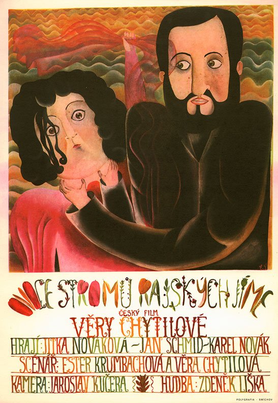
Czech surrealist Eva Švankmajerová’s poster for The Fruit of Paradise (Ovoce stromu rajských jíme, 1969)
As Michael Brooke writes in the April 2015 issue of Sight & Sound, Věra Chytilová’s films are “mercurial, energetic and instinctively pugnacious” – and so are their posters. Designs such as these, made in Communist-era Czechoslovakia, aren’t as celebrated as their neighbouring Polish counterparts, but in the 1950s and 60s they were characterised by just as much graphic abandon and stylistic exuberance.
A Vera Chytilová retrospective runs until 17 March at the BFI Southbank, London.
Daisies is available from Second Run DVD, who also release her Traps on 23 March, Fruit of Paradise plus the short Ceiling on 13 April and Something Different plus the short A Bagful of Fleas later in 2015.
As in Poland, posters were too expensive to import along with the foreign films that were deemed acceptable for audiences by the authorities, and so a homegrown movie-poster industry evolved. While other art forms were strictly monitored and viewed with suspicion, street-lining film posters were a much-encouraged popular and utilitarian art form. With more freedom of expression allowed in the 1960s, filmmakers of the Czech New Wave like Chytilová, Milos Forman and Jirí Menzel emerged, with the poster designs to match the experimentation of their films.
Whereas the Polish poster artists largely favoured a painterly approach, Czech designers used a variety of methods, from montage to woodcut and painting, or often a stew of them all. Photography is often employed in inventive collages, as is newspaper and other odds and ends. Czech posters have a definite surrealist slant, but they aren’t as out-and-out deranged as many Polish designs, and at times can be surprisingly minimal. They have their own auteurs – the most renowned being Zdenek Ziegler, Karel Teissig, Bedrich Dlouhy and Jirí Balcal many of whom collected prizes at international festivals (both Dlouhy and Balcal created posters for Chytilová’s films). A lot of fine artists also contributed occasional designs.
The period also saw an unusually large contingent of female film poster artists working in Czechoslavakia – among them Olga Polácková-Vylealová, Clara Istlerová and Eva Galova Vodrazkova. One name in both camps was Surrealist artist and poet Eva Švankmajerová, who painted the above delirious design for Chytilová’s Adam and Eve fable The Fruit of Paradise. (Švankmajerová was also Jan Švankmajer’s wife, collaborator and his film poster designer of choice.) Indeed the dreamy hand-drawn title design for The Fruit of Paradise looks like it might be Švankmajerová’s work too – the loopy vegetative typography is identical to that on her poster.
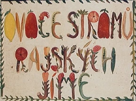
A frame from the title sequence for Chytilová’s The Fruit of Paradise, which might be the work of the film’s poster designer Eva Švankmajerová.
According to Jirí Kofron from Terry Posters, the indispensable film poster archive and shop in Prague, it was unlikely that Chytilová was involved in the commissioning process. “The Central Film Distribution Office, UPF, had a monopoly on movie distribution,” he explains, “and they had their own ‘propaganda’ department that chose which graphic artist would make the best poster for a certain movie. Sometimes the artist didn’t even see the film. Unfortunately archives with documents about the commissions, which documented who attended the screenings, are now lost. But from interviews with artists and commissioners it seems that the directors never had any involvement with it.”
Chytilová was banned from making films after the Soviet invasion in 1968. Did the authorities clamp down on poster design too? “Yes,” Kofron states. “The situation around movie posters changed rapidly after that. But it took some time because at the beginning as many people believed that the Soviets would leave quickly, so even in 1969 there are many interesting movie posters. But then normalisation took place. Many graphic artists as well as movie directors were banned from their work, or even had to leave the country. Because the UPF was increasingly strict and ideological, the quality of movie posters went down – hand in hand with quality of movie production, it must be said. When you don’t have interesting movies, it is hard to have interesting movie posters.”
One designer who regularly contributed posters for Chytilová’s films is Jaroslav Fiser. His inventive designs after the invasion are still as playful and absurd as those he created in the 60s and occasionally even border on the grotesque, but in the 80s and 90s he does notably use more cheerful colours and less collage. His design for Chytilová’s first film after the ban, The Apple Game, won the Silver Hugo poster prize at the International Film Festival in Chicago.
But other posters, their creators and commissioners didn’t fare so well. In her book Czech Film Posters of the 20th Century, Marta Sylvestrova details how a commissioning editor was fired after the paranoid authorities thought they saw a swastika in the negative space between an elephant’s legs in one design. A close-up of a $100 banknote on Zdenek Ziegler’s poster for the western 100 Rifles resulted in him being questioned by the secret police. Meanwhile in his poster for Easy Rider, designer Josef Vyletal was required clunkily to obscure the American flag on the back of Henry Fonda’s jacket with smoke.
The fall of Communism in 1989 had a seismic affect on Czech film poster design. “There were so many changes within the movie industry,” Kofron explains, “and unfortunately artistic movie posters didn’t survive these changes. The UPF disappeared, and so too did the model of commissioning artists. Many new small distribution companies appeared and sadly started using the ‘Hollywood poster’ model, with only pictures of actors and many company logos.
“Artists need space and time to create a visual idea for a poster that can catch you when you walk by,” he continues. “That is impossible in our fast-consuming present. There are a few graphic studios who sometimes make some interesting movie posters now, but it is rare.”
The posters that follow are all Czech designs for Chytilová’s films, unless otherwise noted.
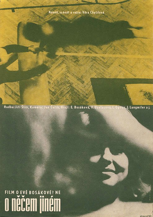
A photographic design by acclaimed graphic artist Bedrich Dlouhy for Chytilová’s 1963 feature debut Something Different (O necem jinem, 1963).
Credit: terry-posters.com
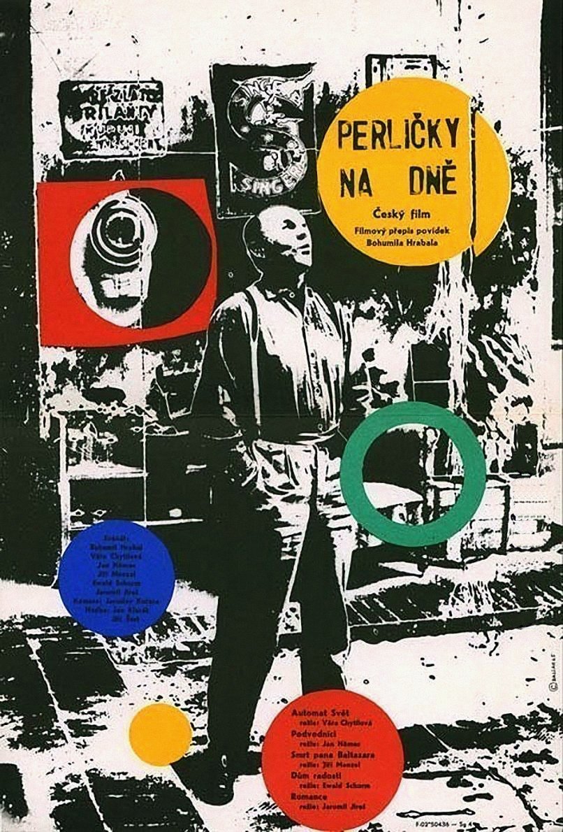
Chytilová contributed the short The World Cafeteria to the 1965 portmanteau film Pearls of the Deep (Perlicky na dne). This design is by Jirí Balcar, one of the first Czech artists to embrace Pop Art.
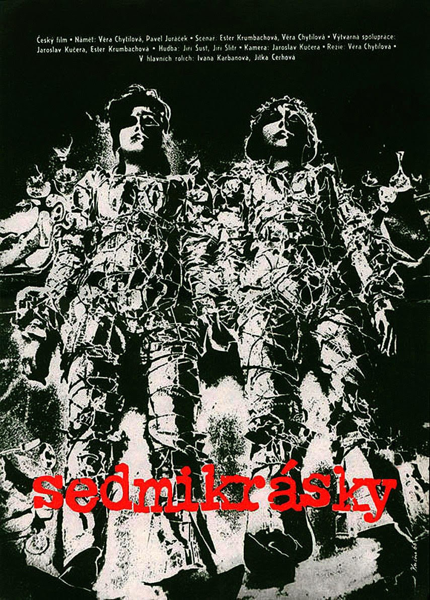
The poster for Daises (Sedmikrásky, 1966) was designed by the film’s cinematographer, and Chytilová’s second husband, Jaroslav Kucera.
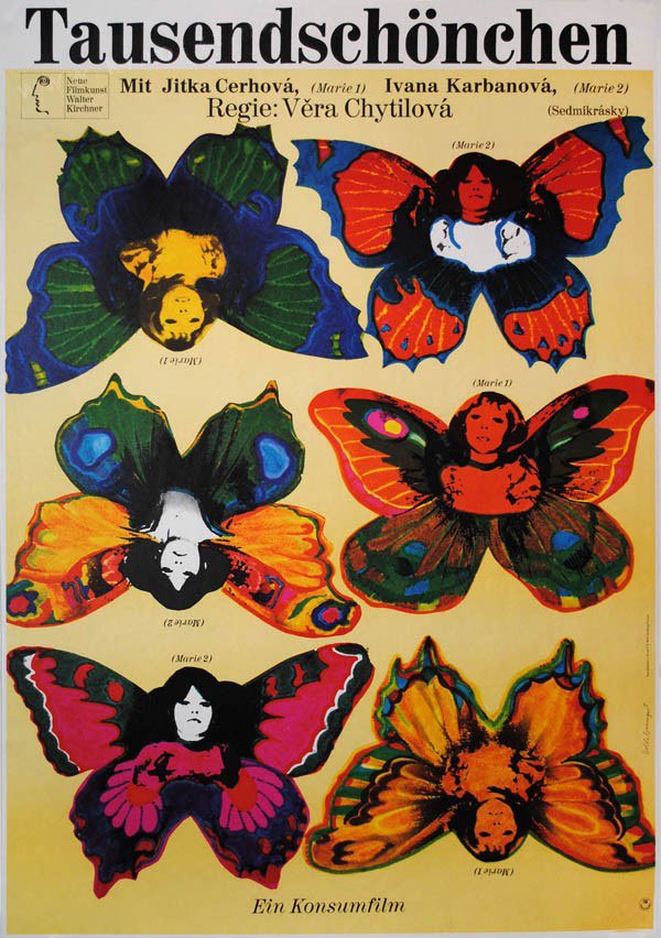
A 1969 West German design for Daises by Isolde Monson Baumgart.
Credit: kinoart.net
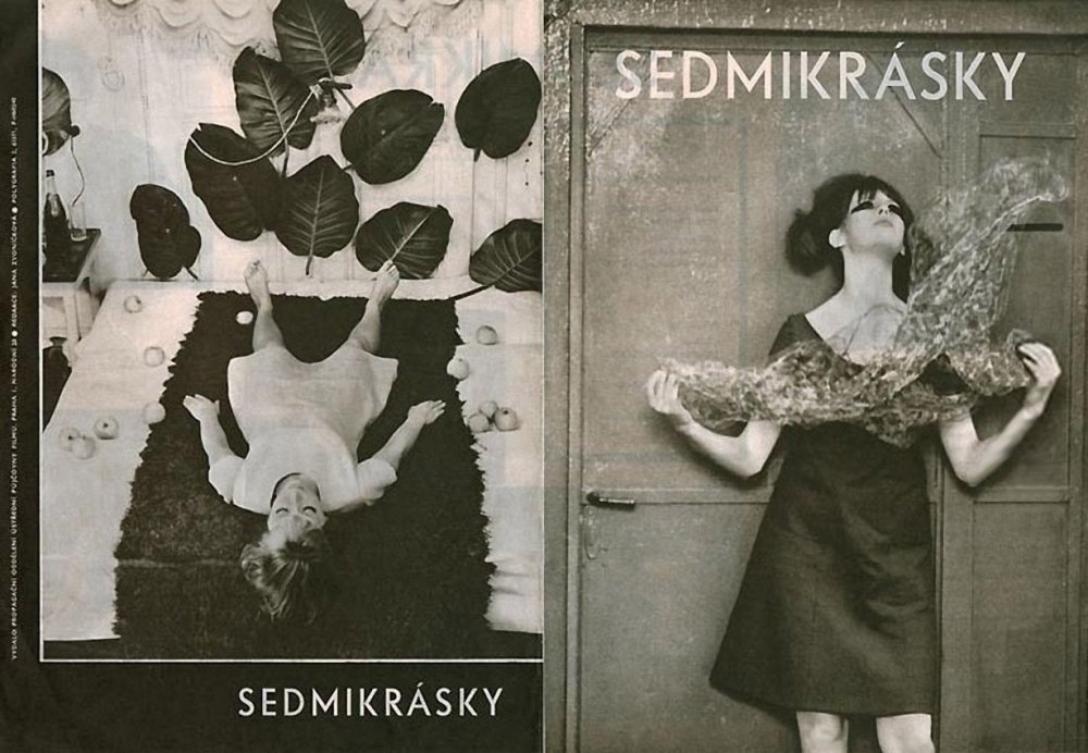
Another Daises design (by an unknown artist), one which uses photography rather than illustration.
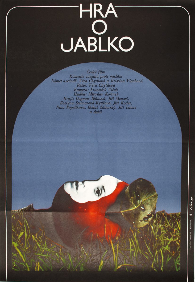
A design for The Apple Game (Hra o jablko, 1976): the first poster Jaroslav Fiser designed for Chytilová, for the first film she made after being banned from filmmaking for several years.
Credit: jozefsquare.com
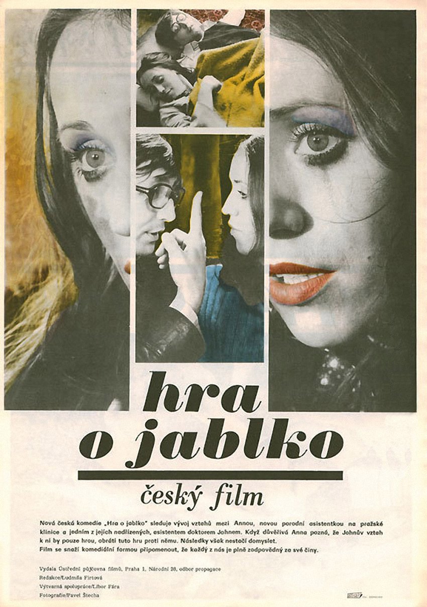
A second Czech design for The Apple Game, by painter and sculptor Libor Fára.
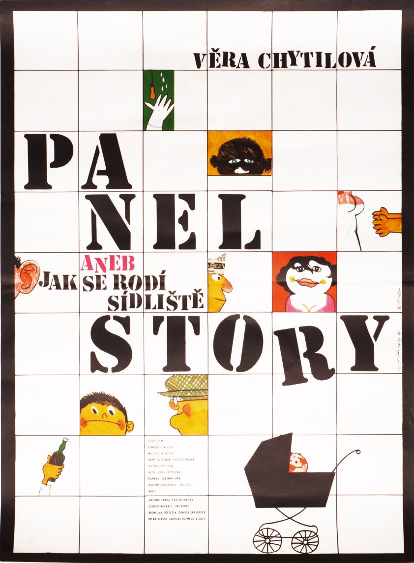
Fiser opted for a hand-painted approach for the playful poster for Panel Story (1979).
Credit: jozefsquare.com
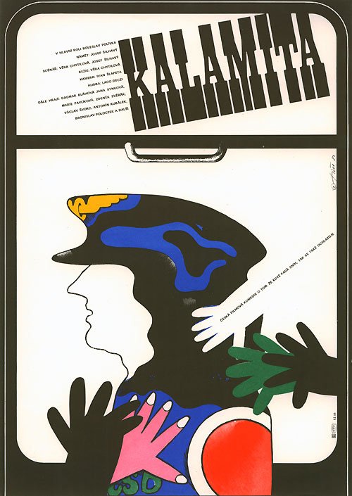
Fiser’s design for Calamity (Kalamita, 1981), about a university dropout retraining as a train driver.
Credit: terry-posters.com
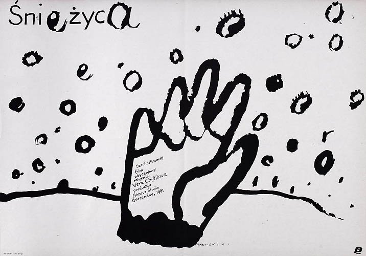
A much more oblique and impressionistic 1988 Polish design for Calamity by Mieczyslaw Wasilewski – though it retains the hand motif of its Czech equivalent.
Credit: terry-posters.com
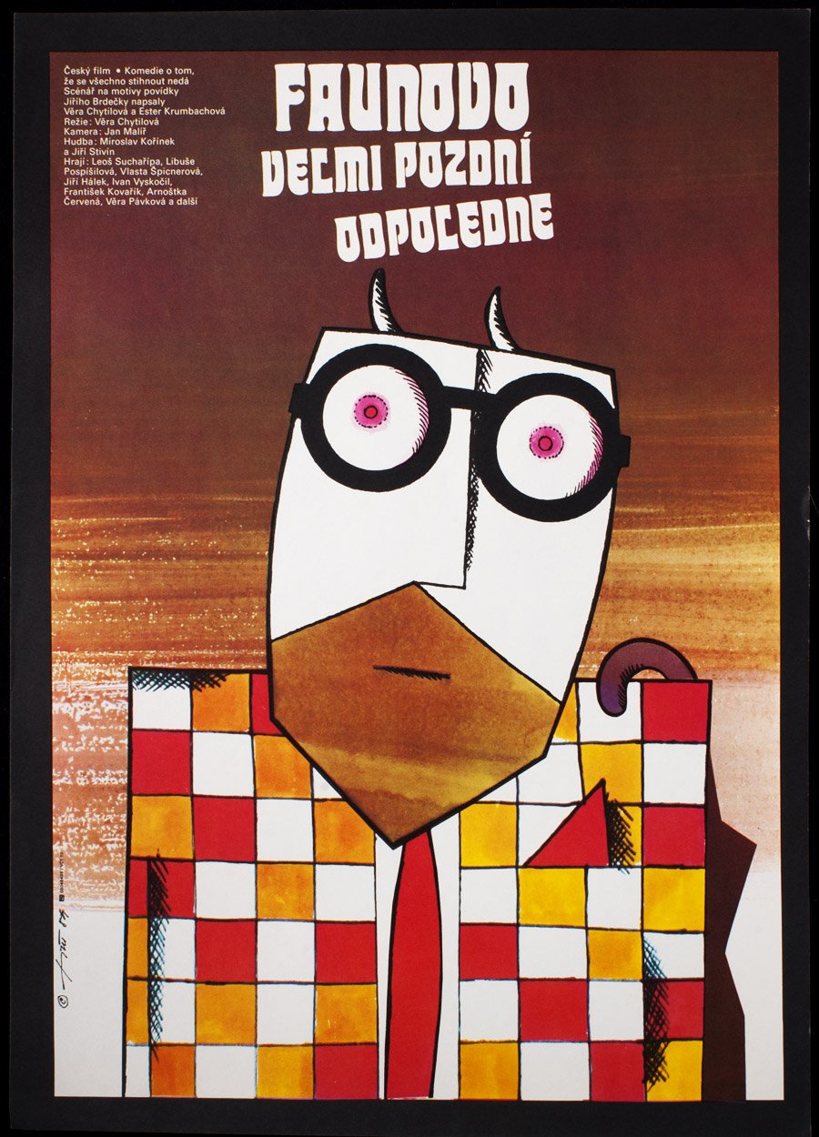
A charming and esoteric design by Jaroslav Fiser for Chytilová’s comedy The Very Late Afternoon of a Faun (Faunovo velmi pozdní odpoledne, 1983).
Credit: jozefsquare.com
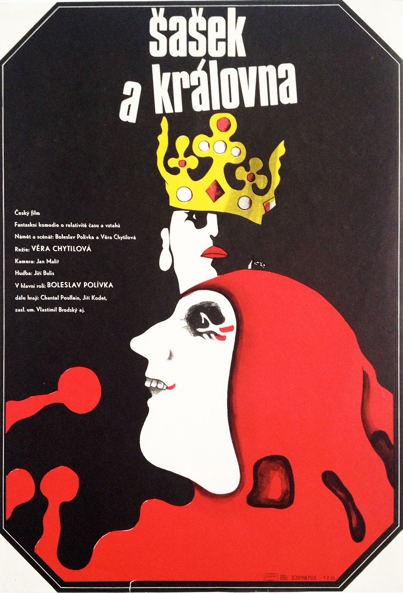
Fiser’s final design for Chytilová, giving more than a hint of the bizarre humour in The Jester and the Queen (Sasek a královna, 1987).
Credit: jozefsquare.com
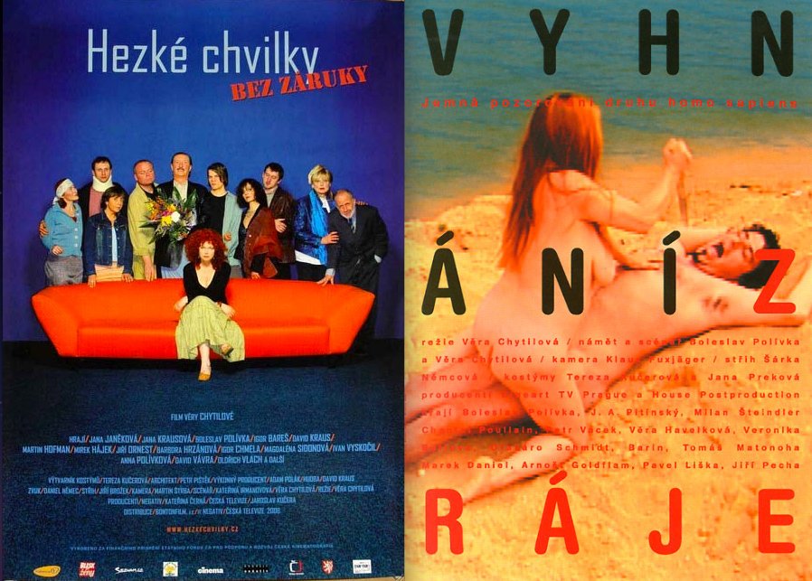
Left: a more conventional poster for Chytilová’s last film Pleasant Moments (Hezké chvilky bez záruky, 2006). Right: a slightly more adventurous photographic design for Expulsion from Paradise (Vyhnání z ráje, 2001). Both were created by unknown designers working for advertising agencies.
Credit: terry-posters.com
Thanks to Jozef Square and Terry Posters – both of which sell posters online – for their help with this article and the illustrations.
In the April 2015 issue of Sight & Sound
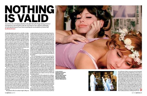
It wasn’t just the communist authorities in the aftermath of the Prague Spring who found the pugnacious, mercurial films of the late Czech director Věra Chytilová challenging – her uncompromising work was intent on pushing the very boundaries of cinema itself. By Michael Brooke.
-
Sight & Sound: the April 2015 issue
Remake/remodel: 50 of the most intriguing director’s cuts and alternative versions. Plus Agnès Varda, Věra Chytilová, Takahata Isao, Adam...
-
The Digital Edition and Archive quick link
Log in here to your digital edition and archive subscription, take a look at the packages on offer and buy a subscription.

