
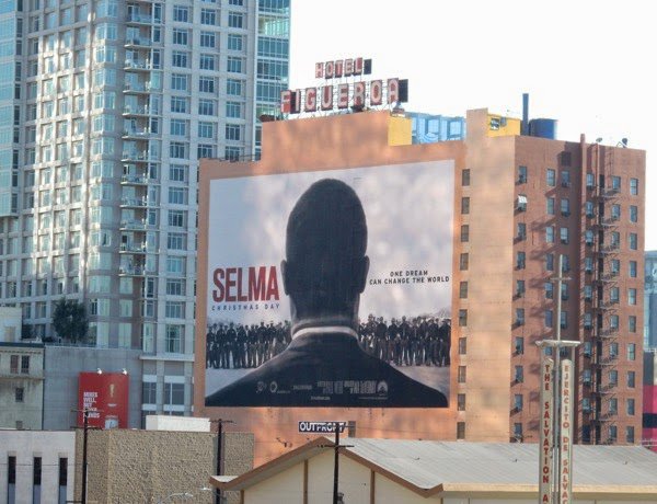
Featuring just the back of Martin Luther King’s head and shoulders is a bold statement for a film poster like Selma’s. It’s a design that’s been used consistently on walls and billboards across the US and UK and it does what posters should do: make you look twice.
Eye contact, or at least facial visibility, is normally obligatory in designs advertising mainstream Hollywood films, and particularly those with Oscar aspirations. There are so many iconic and dynamic images of King for studio marketing bods and designers to adapt but instead Paramount in the US, and Pathé in the UK, opted for a far less famous photograph, that of the back of King’s head taken by then 24-year-old student newspaper photo editor Stephen Somerstein during the five-day-long Selma to Montgomery protest in March 1965.
Dr. Martin Luther King, Jr. looks out at crowd in Montgomery, 1965

Credit: Stephen Somerstein
There’s a small but fascinating tradition of the Rückenfigur motif in film poster history. Look at posters for westerns past and present and you might see an actor’s back in stand-off stance; Christopher Nolan’s recent posters often seem like tributes to Caspar David Friedrich’s Romantic landscapes with their protagonists looking out and up at the spectacle around them (they prompted a slew of imitators); Polish poster art of course provides countless examples of imaginative Rückenfigur; as does the poster for Jessica Hausner’s Amour Fou, coincidentally released at the same time as Selma.
Interestingly, Selma isn’t even the only recent film about racial injustice to have a Rückenfigur poster. Ryan Coogler’s docudrama Fruitvale Station, which reconstructed the last day of Oscar Grant’s life before he was shot in the back by a policeman, did. So too did the design for Lee Daniel’s film about an African-American servant in the White House, The Butler.
Rückenfigur posters for Ryan Coogler's Fruitvale Station and Lee Daniels's The Butler

Selma’s director Ava DuVernay hails from a background in film publicity. Did she have any sway over the film’s poster? The use of Rückenfigur signifies loud and clear that this is not a normal biopic. Instead of picturing in the background King’s fellow protestors (see this alternative design) and selling Selma as an uplifting, triumphant film, both we and David Oyelowo’s King face a wall of white state troopers, who weren’t in Somerstsein’s photo.
If the poster has a downside, it’s that it endorses the misconception that King was one man battling the system solo, which DuVernay took pains to show wasn’t the case (as she elaborates in our March 2015 issue. But it’s a solemn, disruptive and confrontational design, and with its echoes of Ferguson’s street scenes uses photography to foreground race in a way that many film posters haven’t. Remember the controversy last year around the Italian poster art for 12 Years a Slave featuring its ‘protagonist’ Brad Pitt?
Flicking through Separate Cinema: The First 100 Years of Black Poster Art, the lavish film poster compendium compiled from John Kisch’s extensive collection, shows the extent to which racism has plagued film poster design, much as it has magazine covers (and continues to do so, a case in point being this February’s UK Vogue – Jourdan Dunn is the magazine’s first solo black model cover star in 12 years).
Through the prism of posters, Kisch’s Separate Cinema provides an essential overview of black cinema. Little-known designs about little-known films sit alongside those for lauded films by directors such as Oscar Micheaux and Sidney Poitier. But the book also highlights how, particularly in Hollywood posters, black faces and figures have been caricatured, obscured, abstracted or, occasionally, absented entirely.
Kisch’s collection uncovers a lively tradition of poster design for early independent black films (whose directors were keen to counter the negative stereotypes of The Birth of the Nation). Problems occur when films featuring black actors started to be marketed to white audiences. It’s noticeable throughout Separate Cinema how often black actors are pictured as silhouettes – a trend that isn’t nearly as prevalent in posters advertising films with white actors.
Sometimes, as the book’s co-editor Tony Nourmand points out in his introduction, this was out of financial necessity – multi-coloured nuanced illustrations were beyond the budgets of many smaller films. Sometimes it’s simply down to artistic invention – such as Al Hirschfeld’s take on Vincente Minnelli’s Cabin in the Sky. Or a case of stark monochrome being enlisted as a mode of resistance.
.")
Al Hirschfeld’s exuberant design for the American release of Vincente Minelli's Cabin in the Sky (1943).
Credit: SeparateCinema/Reel Art Press
But in other instances, you have to question why actors’ faces weren’t shown or were obscured when a beaming, yearning, scowling face, illustrated (or increasingly from the 1960s onwards, photographed), was the standard poster decoration? Are there disquieting rationales behind these beautiful images? Some designs appear to deliberately lighten an actor’s skin. In others there are no actors pictured at all. By contrast, the dynamic designs of 1970s Blaxploitation posters frequently cram in as many faces and bodies as possible.
Using tints to conceal an actor’s race was common even in the 1990s. A 1993 Entertainment Weekly article on the subject found that more than half the films with black performers released the previous year used posters and newspaper ads that “disguised the actors’ race – or excluded their likenesses altogether”. Chris Pula, then New Line’s theatrical marketing president, is quoted as saying of the advertisements for the Hughes brothers’ Menace II Society: “I didn’t want people to open the newspaper and have as the first thing they see two young, black faces. People will say, ‘It’s a black movie; I don’t want to see that.’ Whether I like it or not, people will pass judgment on a single image. It’s my job to get the most people into a movie possible.”
Gathered here is a small selection of posters from Separate Cinema, along with a few other notable (and questionable) designs. Not all of these are examples of dubious mis-marketing practices. Some are designs that celebrated their actors or drew attention to and actively fought against racist representations.
One director who has always recognised the power of a poster is Spike Lee. So many of his films have provocative and thoughtful ones, none more so than that for Bamboozled (2000), which appropriates and parodies offensive stereotypes rife in film, popular art – and film posters – in the early twentieth century.
A selection of black movie posters
 was a meldroma from Monarch Productions, a black-owned production company in New York")
The Flaming Crisis (1924) was a meldroma from Monarch Productions, a black-owned production company in New York
Credit: SeparateCinema/Reel Art Press
An example of a beautiful and cheap-to-produce design (by an unknown artist) for Dudley Murphy's 15 minute short Black and Tan (1929), about Duke Ellington and his Cotton Club Orchestra.
 for Dudley Murphy's 15 minute short Black and Tan (1929), about Duke Ellington and his Cotton Club Orchestra.")
Credit: SeparateCinema/Reel Art Press
Where is Sidney Poitier in these artful posters for No Way Out (1950) and In the Heat of the Night (1967)?
 and In the Heat of the Night (1967)?")
Credit: SeparateCinema/Reel Art Press
 portrayed an interracial friendship (between Sidney Poitier and John Cassavetes) and showed a black man in a position of authority. Saul Bass was reportedly instructed by the studio to avoid any indication of this in his design.")
Edge of the City (1957) portrayed an interracial friendship (between Sidney Poitier and John Cassavetes) and showed a black man in a position of authority. Saul Bass was reportedly instructed by the studio to avoid any indication of this in his design.
Credit: SeparateCinema/Reel Art Press
")
Spot the difference between this 1959 poster for the Broadway production of A Raisin in the Sun and the design for 1961 film (both starring Sidney Poitier)
Credit: SeparateCinema/Reel Art Press
, left, and the West German design, right.")
Compare the colour of Sidney Poitier's and Dorothy Dandridge's skin in the Hollywood poster for Otto Preminger's Porgy and Bess (1959), left, and the West German design, right.
")
The East German poster for Porgy and Bess (1959)
Credit: SeparateCinema/Reel Art Press
 was the first big-budget western to feature a black hero. One of its American posters refelects that, another doesn't.")
John Ford's Sergeant Rutledge (1960s) was the first big-budget western to feature a black hero. One of its American posters refelects that, another doesn't.
, which brings race to the fore.")
The poster for Ossie Davis’s 1963 satire The Man from C.O.T.T.O.N. (aka Gone are the Days!), which brings race to the fore.
Credit: SeparateCinema/Reel Art Press

The design for the 1974 film Foxy Brown featured a host of faces and figures, as did many American blaxploitation movie posters.
Credit: SeparateCinema/Reel Art Press
, and a poster that makes a statement out of its use of blackness.")
A striking, minimal Russian design for Richard Attenborough’s Cry Freedom (1987), and a poster that makes a statement out of its use of blackness.
Credit: SeparateCinema/Reel Art Press
.")
Whoopi Goldberg as a beautiful silhouette in the design for Steven Spielberg’s The Colour Purple (1985).
Credit: SeparateCinema/Reel Art Press
 catalogues Hollywood caricatures of black people, so does its poster.")
Just as Spike Lee’s Bamboozled (2000) catalogues Hollywood caricatures of black people, so does its poster.
Credit: SeparateCinema/Reel Art Press
, left, and Tyler Perry and Elvin Ross’s Madea’s Family Reunion (2006), right, both using bold silhouettes to draw attention to their black protagonists.")
Posters for Lee Daniels’s Precious (2009), left, and Tyler Perry and Elvin Ross’s Madea’s Family Reunion (2006), right, both using bold silhouettes to draw attention to their black protagonists.
Credit: SeparateCinema/Reel Art Press
-
Sight & Sound: the March 2015 issue
Selma and the art of protest, from Alabama in 1965 to modern-day Kiev and Cairo. Plus the whims and wiles of Eros in It Follows, The Duke of...


