Ken Adam, who died last Friday at the age of 95, became the most famous production designer in the world, indeed defined what being a production designer meant for many people. This was partly due to at least three handsomely illustrated books that chronicled his career, but above all to a small number of spectacular ‘iconic’ (for once the word seems entirely appropriate) films among the more than 40 that he designed. And to his willingness to talk about these endlessly and engagingly.
For the first Bond, Dr. No, made in 1962 on a risibly low budget, “I had to fill three of the largest stages at Pinewood studios with sets. There was no time to do sketches and no one looking over my shoulder. I wanted to do away with all the old materials of set-building, wood and paper, and use new materials. My crew was very excited, but it was taking an enormous risk. The producers and director came back from location work in Jamaica just four days before we were to start shooting, and I was petrified.”
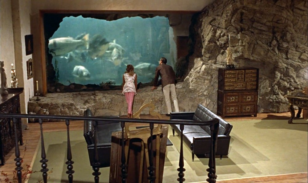
Dr. No (1962)
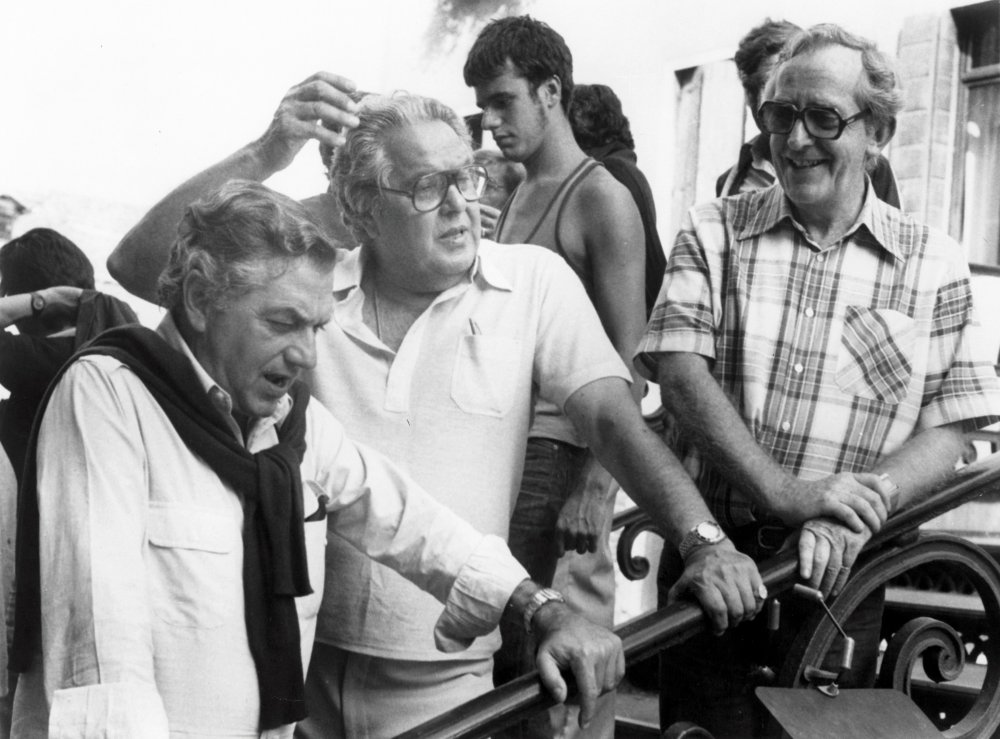
Left to right: Adam, producer Albert Broccoli and director Lewis Gilbert on the set of Moonraker
It’s hard to imagine Adam being scared, even meeting him at the age of 91, as I did four years ago. And Dr. No’s director Terence Young, along with its famously tough producers, Cubby Broccoli and Harry Saltzman, were duly impressed, even though he’d overspent on the film’s modest budget by a whole £6,000. No one of course knew that Bond would become the longest-running franchise in British film history, and although Adam designed only seven Bonds over a 20-year period, he became almost as well-known as the successive actors who played 007, and his exotic adversaries and dangerous girlfriends.
Adam had no need to read any of the Fleming novels, since these offered little detail on the settings for his hero’s adventures, leaving the designer not only free, but obliged to create plausible fantasies. Moreover, raising the stakes for each successive film was a responsibly that he relished.
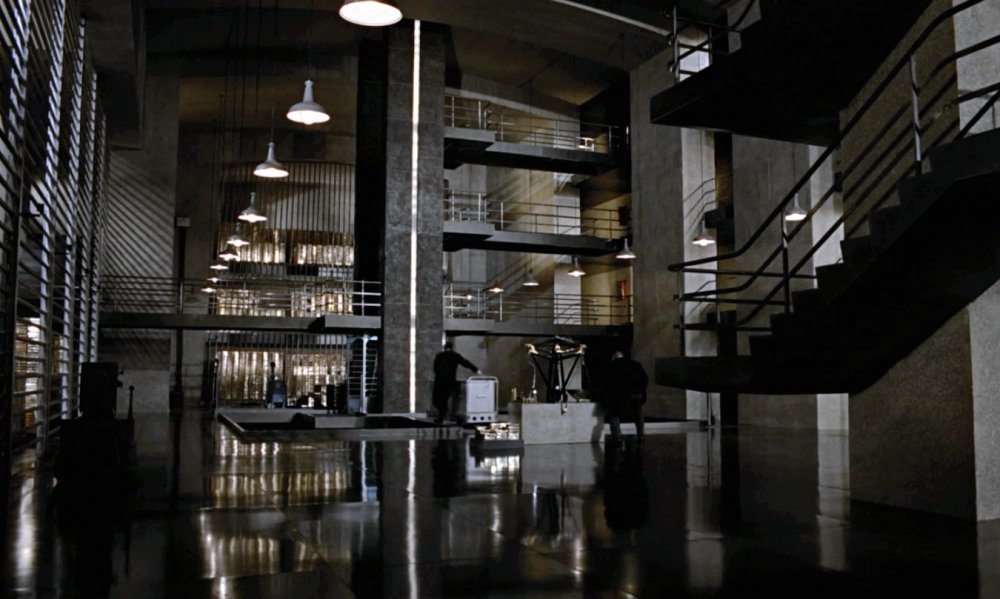
For Goldfinger in 1964, the challenge was to design something that everyone has heard of but no one had ever described: the inside of the US Treasury’s bullion store, Fort Knox. Adam managed to inspect the Kentucky building from the air – he described it as “very dull 1920s art nouveau”, albeit defended with machine guns and loudspeakers. But the interior of Fort Knox, which apparently even US presidents had never seen, had to be pure speculation. “I built it like a cathedral of gold, over 40 feet high, right up to the studio roof, and for the gold ingots we had a special lacquer finish that made them look better than the real thing.”
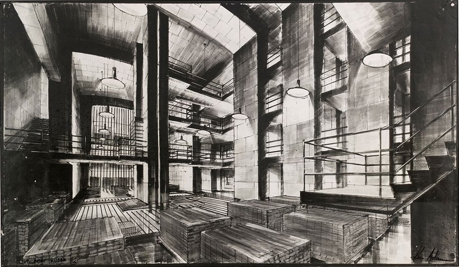
Inside Goldfinger’s Fort Knox
Credit: © Ken Adam Archive/Deutsche Kinemathek
As ambitions and budgets grew with the worldwide success of the franchise, Adam found himself working on an increasingly massive scale and budget. He clearly relished high-profile research contacts. For The Spy Who Loved Me (1977), “I knew Colin Chapman, the founder of Lotus, and I talked to people in the US who did mini-submarines, who made the Lotus Esprit actually work under water.” And for his last Bond film, Moonraker (1979), which has a villain who plans world domination from a space station, “I spent some time at NASA, finding out what they intended to do. These scientific institutions are always very helpful.”
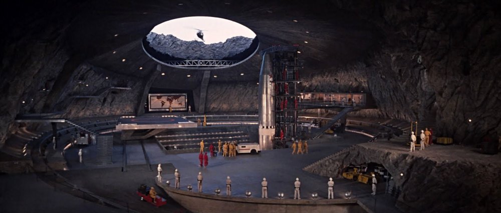
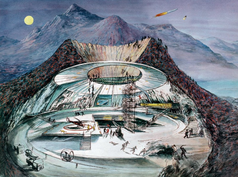
Adam’s vast and truly impressive sets for Moonraker ranged from a Mayan-style command centre, supposedly located in the Brazilian jungle, to a Space Shuttle housing a conference centre dominated by giant rocket-exhaust ducts. They occupied the three largest French film studios, where the production was based for tax reasons, and at first there were battles with the French unions. “By the end of the shoot, when they had built something special like the space station, they were really proud of what they’d done.” Adams remembered his dauntless English construction manager once boasting in an interview: “Whatever he can draw, I can build”.
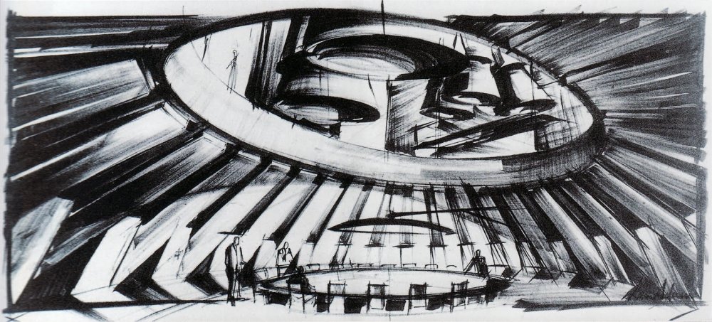
Moonraker’s conference room: sketch, model, film set
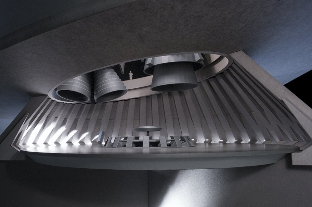
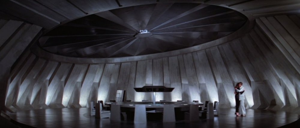
Some film designers want to emphasise realism, but Adam had been inspired by such Hollywood greats as William Cameron Menzies, for whom the term ‘production designer’ was originally coined, and Cedric Gibbons, the long serving head of design at MGM. “They taught me not to be afraid, so whenever possible I was enhancing or stylising reality. Fooling the audience, but in a nice way.”
Having trained as an architect after wartime service in the RAF, he became a skilled draughtsman. “Eventually I realised I had to release myself from the drawing board and work more freely,” and so began the bold sketches for which he has become famous. Behind these lay many influences, from the German designers of the Bauhaus in the 1920s, whose use of new materials and “a new sense of space” he admired, back to the 18th-century Roman printmaker Giovanni Batista Piranesi, whose Imaginary Prisons were an inspiration for the labyrinth of stairways and arches that Adam created as the underground grotto in one of his departures from hi-tech fantasy, Chitty Chitty Bang Bang (1968), based on Fleming’s children’s book, where the children of Vulgaria are hidden by their parents to escape the ruler’s terrifying Child Catcher.
Above ground, Adam used a real Bavarian castle, the fairytale Neuschwanstein, “designed by a theatre designer for King Ludwig, like a toy castle”. But the film’s eponymous fantasy-automobile, which flies as well as taking to the water, had to be mocked up in the studio. “That was one of my most difficult tasks, to design a car from the early 20th-century which is also sexy. We built a prototype in the Pinewood plasterers shop, and years later one of the technicians told me, ‘You were impossible.’ But the end result was good.”
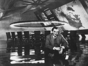
There was no doubt about Adam’s favourite among all his designs: the War Room for Stanley Kubrick’s 1963 apocalyptic black comedy Dr. Strangelove. “He rang me up and said he’d just seen Dr. No, and would like to talk to me about Dr. Strangelove.” After three weeks work on the War Room design, Kubrick insisted on scrapping it and starting again. “He was standing behind me as I drew, and he said, ‘Yes, a triangle is the strongest form in geometry. Can we have concrete, green baize on the table, and an unsupported ring above for lighting?’ We spent many evenings together, working it out.”
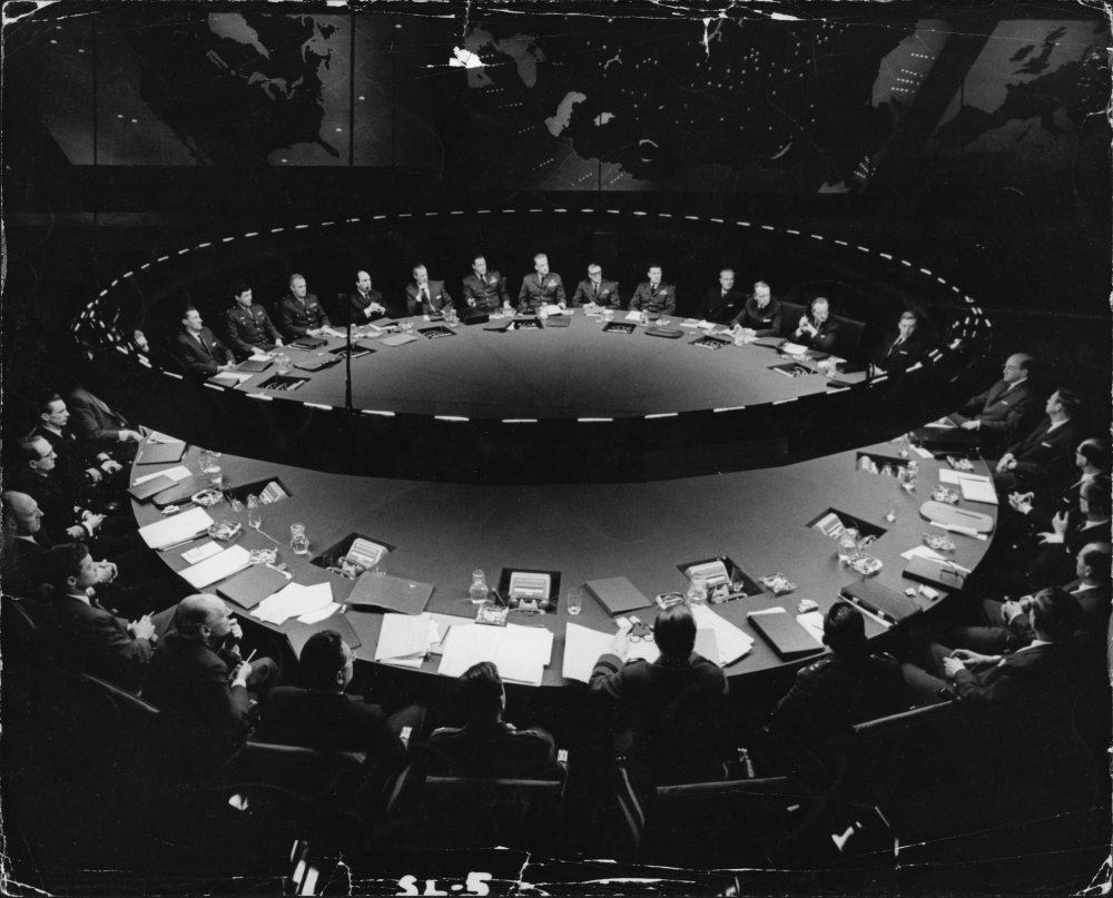
Dr. Strangelove’s War Room
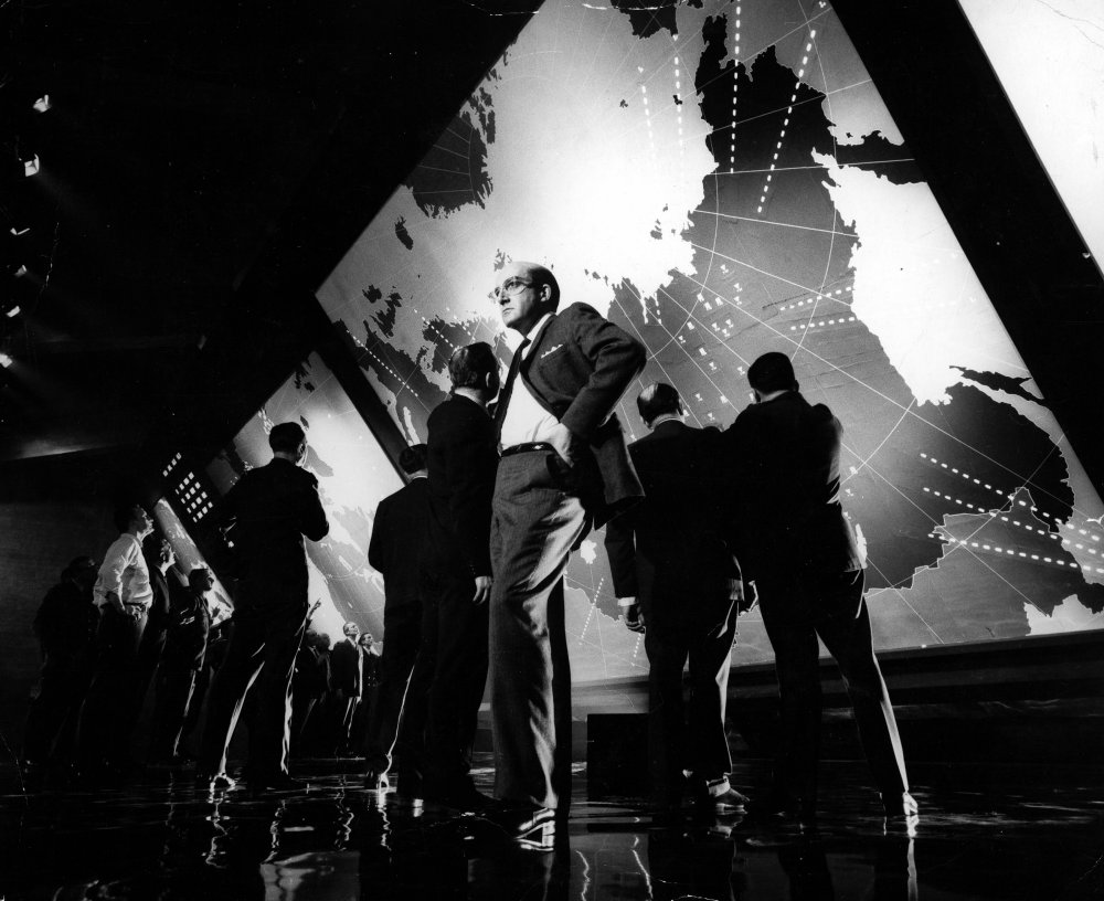
Peter Sellers as President Merkin Muffley with fellow world leaders in Dr. Strangelove
It turned out that nothing in this eerily plausible setting for deciding the world’s fate was easy to achieve. “I wanted a shiny black floor, like I’d seen in the Fred Astaire musicals, which the construction people said would be easy. But it turned out like a seascape! So we had to go on experimenting to achieve that effect.” And for the giant screens that display the map of Soviet Russia and the bombers’ route, “Stanley didn’t want to use 16mm projection, which could go wrong, so I made plywood boxes for the screens lined with photographic paper that had to be air-conditioned.”
The result, famously, was so convincing that it fooled at least one incoming US president. Adam believed it was a true story that Roland Reagan asked in 1981 to see the War Room – only to learn that it only ever existed on screen. Posterity may well come to value some of Adams’ elegant period designs as highly as his boys’-own fantasies, especially the eighteenth-century settings of Barry Lyndon (1975) and The Madness of King George (1994). But when I asked him if he’d ever created something that lay viewers would be unaware of – a question that many production designers welcome – he looked puzzled. “I thought reality was dull, and if I give the audience something unexpected they’ll enjoy it”.
-
The Digital Edition and Archive quick link
Log in here to your digital edition and archive subscription, take a look at the packages on offer and buy a subscription.


